Navigation Appearance
Administrators can configure the colors used by the application's navigation sidebar, so the navigation matches a customer's branding without any code change or deployment.
Before this setting existed, only the navigation background color could be configured; the text, the selected item, the separators, and the hover widget menu all used fixed colors.
Every color is optional. Until one is configured the navigation looks exactly as it does today, so existing tenants see no change.
Configuring the colors
Open Navigation in the admin application and select the settings icon (Navigation settings and appearance). The settings panel opens from the right; on smaller screens its content scrolls while Reset All Colors, Cancel and Save stay visible. The colors are grouped under Navigation Appearance in three sections, and every section lists its fields in the same order: Background Color, Text Color, Separator Color.
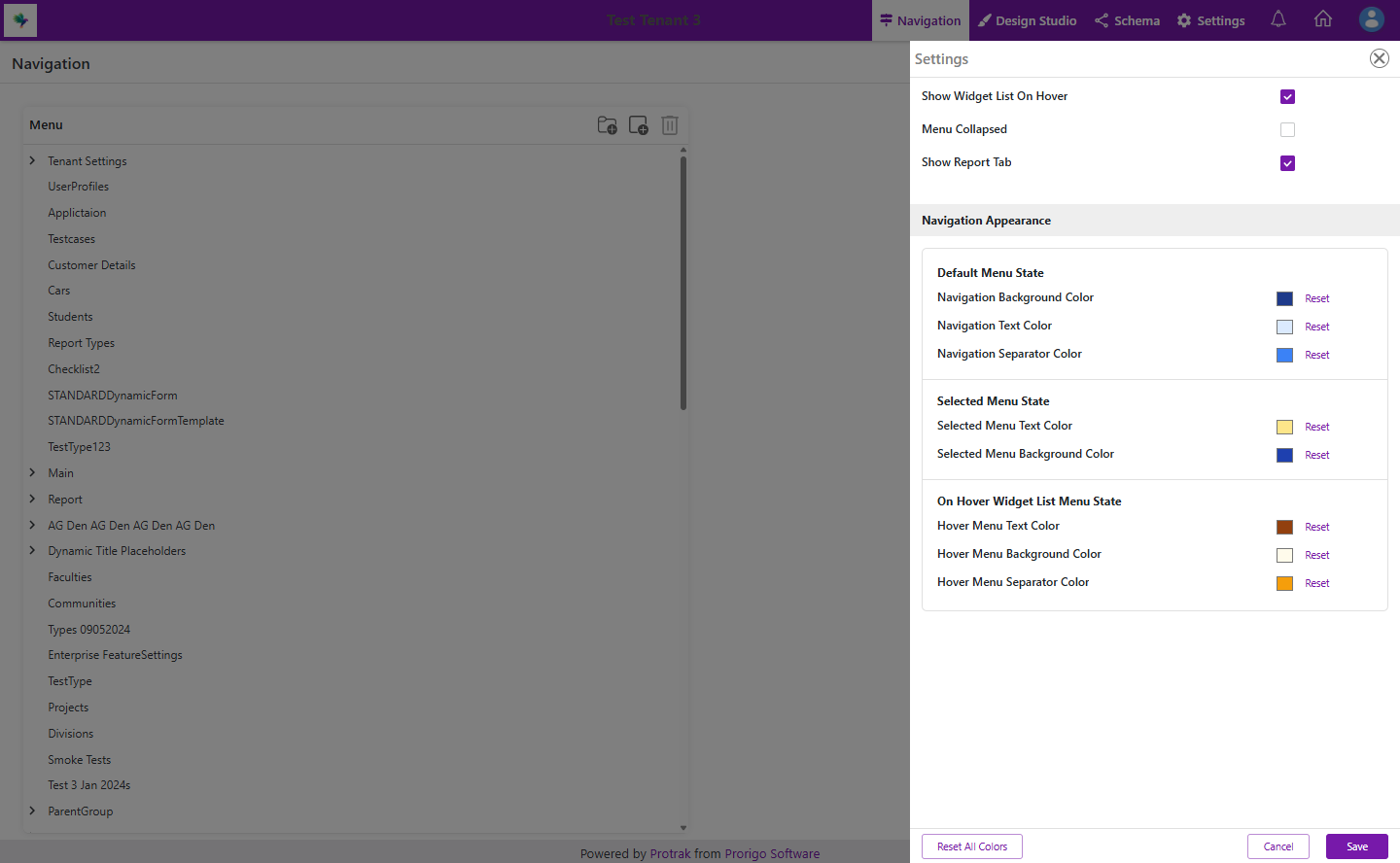 The Navigation Appearance section of the Navigation Settings flyout, with all eight colors configured — the Navigation Menu, Selected Navigation Menu Item and Hover Menu groups, a Reset action beside each field, and Reset All Colors in the footer.
Navigation Menu — the navigation in its normal state.
| Setting | Applies to |
|---|---|
| Background Color | The sidebar background |
| Text Color | Menu item labels and icons |
| Separator Color | A line below every menu item, including the last one, and around expanded menu groups |
Selected Navigation Menu Item — the menu item for the page currently open.
| Setting | Applies to |
|---|---|
| Background Color | The selected item's row background |
| Text Color | The selected item's label and icon |
Hover Menu — the widget list shown when the pointer rests on a menu item.
| Setting | Applies to |
|---|---|
| Background Color | The hover menu background |
| Text Color | The hover menu's title and row text |
| Separator Color | The hover menu's border and the dividers between its rows |
Colors are chosen with the same color picker used elsewhere in the platform. Each field has its own Reset action to clear that one color, and Reset All Colors in the footer clears every color in the section at once. Clearing a color restores the default appearance rather than setting a color of its own. A field that is not set shows the color the client application currently uses for it, taking the tenant's theme into account.
Changes apply once the configuration is saved and the user's session refreshes.
The screenshots on this page all use the same configuration:
| Section | Setting | Value |
|---|---|---|
| Navigation Menu | Background Color | #1E3A8A |
| Navigation Menu | Text Color | #DBEAFE |
| Navigation Menu | Separator Color | #3B82F6 |
| Selected Navigation Menu Item | Background Color | #1E40AF |
| Selected Navigation Menu Item | Text Color | #FDE68A |
| Hover Menu | Background Color | #FFFBEB |
| Hover Menu | Text Color | #92400E |
| Hover Menu | Separator Color | #F59E0B |
How the colors appear
The configured colors are applied throughout the navigation sidebar — every menu item and sub-menu item, the selected item, and the hover widget menu.
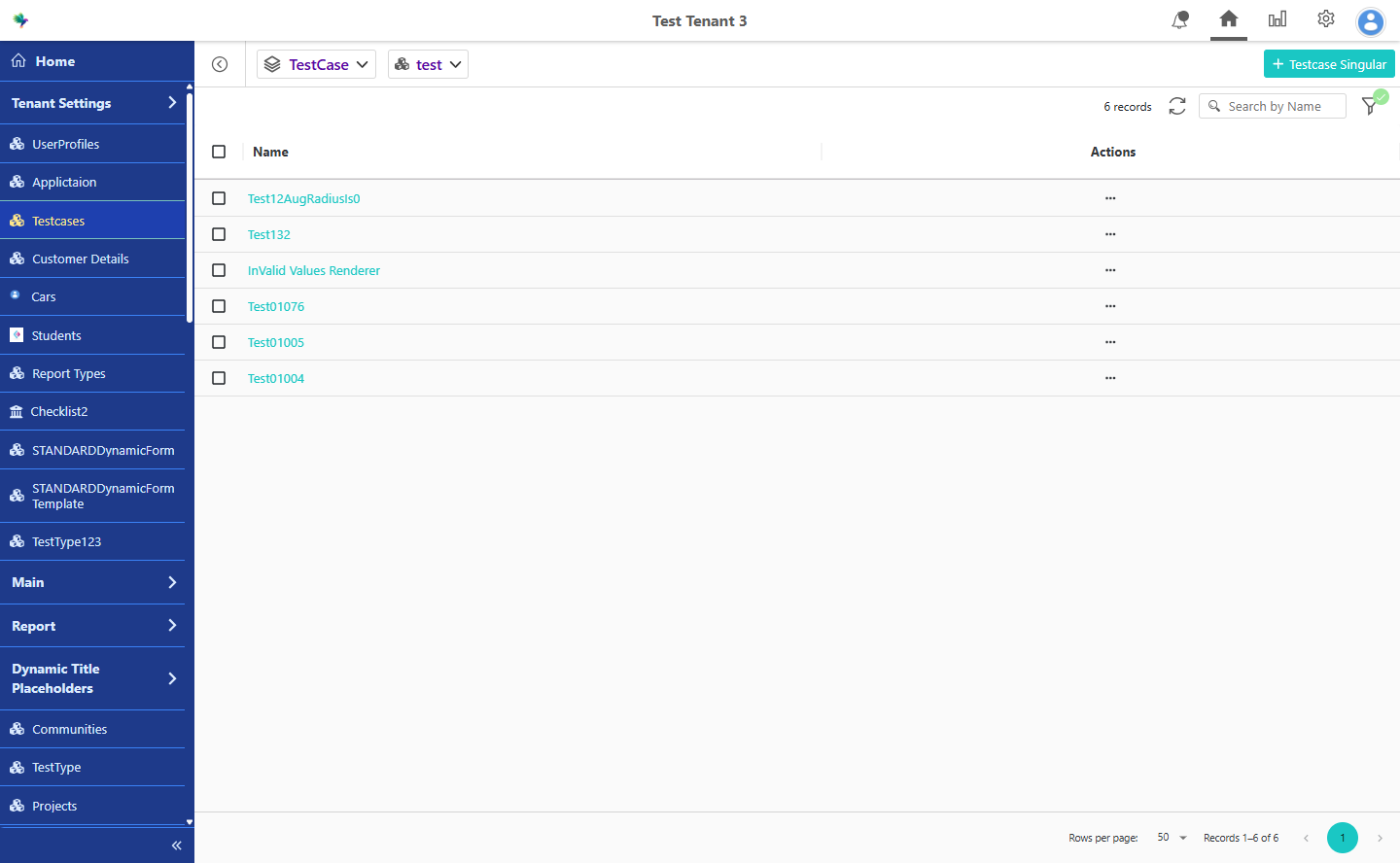 The navigation sidebar with the colors configured above applied — the menu background and text follow the Navigation Menu settings, the open page (Testcases) uses the Selected Navigation Menu Item colors, and separators are drawn between items because a separator color is configured.
The hover widget menu is colored independently, so it can be styled to stand out against the sidebar rather than blend into it.
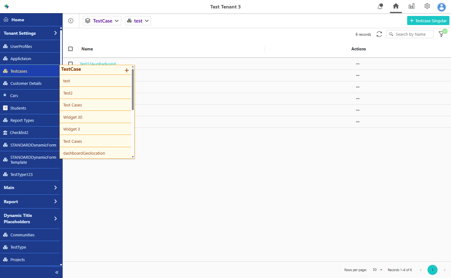 The hover widget menu using its own Hover Menu colors — background, text, and the dividers between widget rows — which are configured independently of the sidebar colors behind it.
What happens when a color is not set
Each setting falls back independently, so colors can be configured a few at a time.
| Setting | When it is not configured |
|---|---|
| Navigation Menu Background Color | The platform's primary color |
| Navigation Menu Text Color | The platform's surface color |
| Navigation Menu Separator Color | No lines are drawn between menu items or around menu groups; the borders around the Home item and the collapse button keep their default color |
| Selected Navigation Menu Item Background Color | Follows the Navigation Menu background color |
| Selected Navigation Menu Item Text Color | Follows the Navigation Menu text color |
| Hover Menu Background Color | The hover menu's default background |
| Hover Menu Text Color | The hover menu keeps its existing text colors: the title uses the theme's dark accent color and the rows use the primary text color |
| Hover Menu Separator Color | The hover menu's default border and divider color |
Two of these are worth noting:
- Selected Navigation Menu Item colors follow the Navigation Menu colors unless set. A tenant that configures only the Navigation Menu gets a selected item that matches the rest of the menu, rather than an unexpected highlight.
- Separator lines between menu items and around menu groups are only drawn once the Navigation Menu separator color is configured. They are not part of the navigation's default appearance, so they appear only when an administrator opts in.
Use case: Matching a customer's brand
A customer's brand uses a dark navigation bar with light text, and highlights the active item in the brand's accent color.
An administrator sets the Navigation Menu background color to the dark brand color and its text color to the light one. The selected item automatically follows both, so the menu is already consistent. To make the active page stand out, they then set the Selected Navigation Menu Item background color to the accent color and its text color to a color that reads against it.
The hover widget menu is left unconfigured, so it keeps its default appearance.
Example: A tenant configures only the Navigation Menu and Selected Navigation Menu Item colors. The navigation adopts the brand colors immediately after the configuration is saved, the hover menu continues to look as it always has, and no deployment is required.