Admin Configuration Guide
Design Studio in the Admin panel is organized into three independent modules that work together to define your application's layouts. The right starting point depends on what you want to build.
Accessing Design Studio
Clicking the Design Studio button in the Admin panel toolbar opens the Design Studio landing page (User Guide). This page provides an overview of the feature and helps you get familiar with its functionality.
On the left side, you will see three module options:
| Module | Route | Purpose |
|---|---|---|
| Page Templates | /designstudio/pageTemplates | Visual layout builder for all page types |
| Type Widgets | /designstudio/typeWidgets | Define Dashboard, Report, and Relation widget data |
| Forms | /designstudio/forms | Build form layouts for Create, Edit, and View pages |
- Each module's grid page has an ⓘ info icon next to the search and create controls. Clicking it opens a built-in user guide popup specific to that module — useful for a quick reference without leaving the page.
- The Design Studio landing page — a built-in User Guide with the three module sections (Page Templates, Type Widgets, Forms) in the left sidebar.
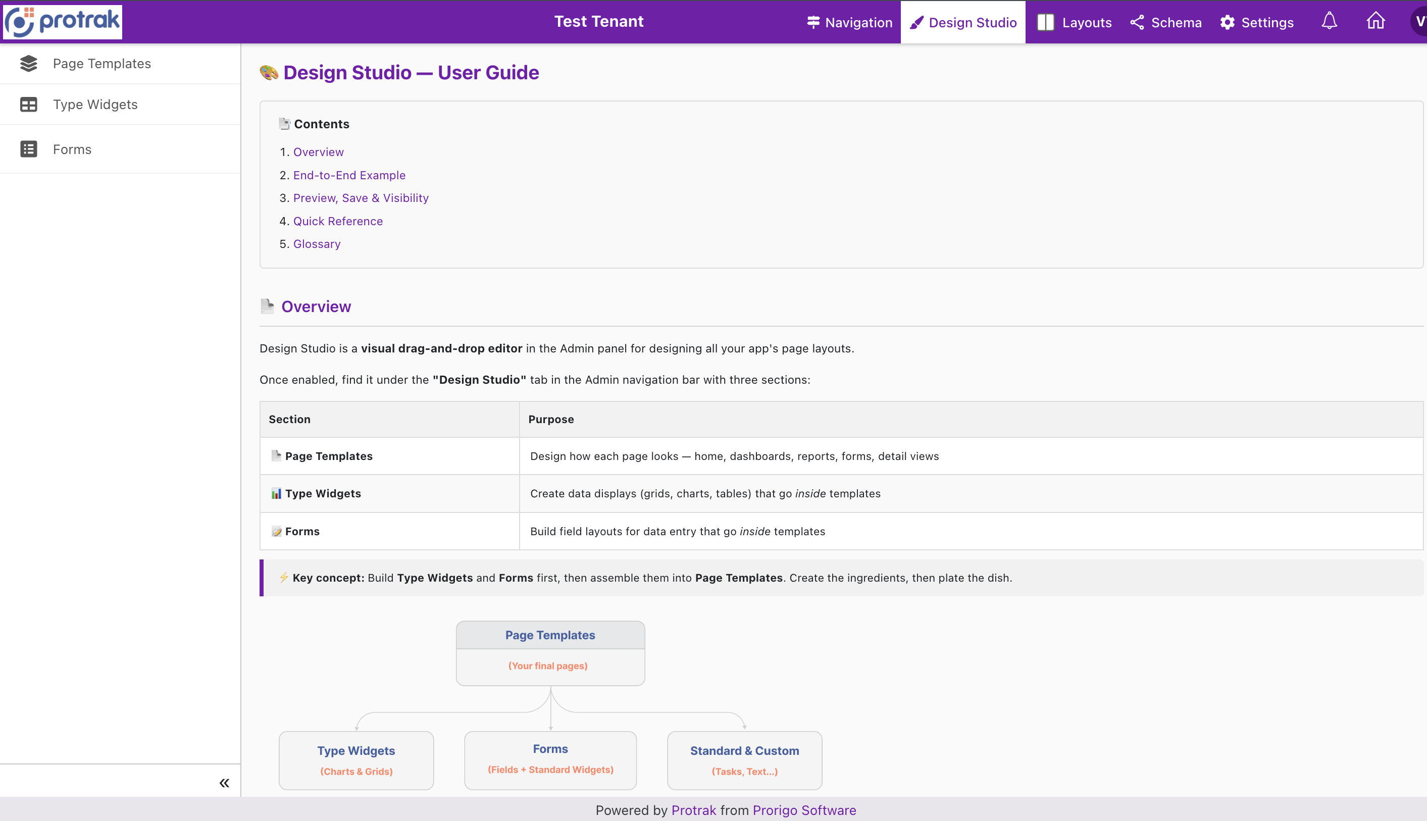
Recommended order: Set up Type Widgets and Forms first — they are the building blocks that you pull into Page Templates. Think of it like preparing your ingredients before assembling the dish.
Module 1: Page Templates
Page Templates define what a page looks like — which widgets appear, where they sit, and who can see them. Every page in the client app is powered by a template.
What You Configure
- Template details — Name, display name, template type (Home / Dashboard / Report / Create / Edit / View), associated type, and background color
- Visibility — Everyone or Specific Roles
- Canvas — Drag widgets from the library, position and configure each widget; adjust layouts per device
- Widget settings — Title, border, role visibility, and type-specific properties per widget
The grid supports Search, Create, Edit, Clone, Delete, Export, and Pagination.
For the full guide — what goes inside each template type, creating templates, the visual editor, widget library, device switching, and more — see Page Templates.
Module 2: Type Widgets
Type Widgets are named, reusable data components that you define once and drop into multiple Page Templates of the same Type. Each widget is tied to a Protrak type and a Query Definition that determines what data it fetches.
Widget Categories
| Widget Type | Used In Templates | Shows |
|---|---|---|
| Dashboard Widget | Home, Dashboard | Tabular data with columns, filters, actions, and toolbar |
| Report Widget | Home, Dashboard, Report | Analytical reports |
| Relation Widget | View | Related instances from a configured relation query |
What You Configure
Each Type Widget has these configuration sections:
- Basic details — Name, display name, type, widget category, and Query Definition
- Column Designer — Which attributes to show, column order, renderers, editors, conditional formatting, and link options
- Filter Settings — Default data filters (state filter, attribute filters, parent filter, relation filter — all powered by the Query Definition)
- Sort Configuration — Default sort column and direction
- Toolbar Settings — Export, Print, Refresh, column visibility toggle
- Action Buttons — Row-level actions (Navigate, Edit, Delete, Duplicate, etc.) and bulk actions
The Query Definition you attach is the backbone of a Type Widget — it determines which data is fetched and which attributes are available in the Column Designer. Choosing the right query (and how it's configured) directly shapes what you can show.
For the full guide on creating Type Widgets, configuring columns, and understanding how Query Definitions drive the Column Designer, see Type Widgets.
For setting up Query Definitions themselves, see Query Definitions.
Module 3: Forms
Forms are drag-and-drop field layouts for Create, Edit, and View templates. They are built for a specific Protrak type and define how the data entry (and display) experience looks for that type's instances.
A form is not the page itself — it is a widget placed inside a Create, Edit, or View template. You build the form separately here, then add it to the template.
What You Configure
- Basic details — Form name, display name, and associated type
- Form Canvas — Drag type attributes from the Form Library onto a grid canvas, resize and arrange them freely
- Field Settings — Per-field: label, placeholder, required/optional, read-only, default value, validation rules, display conditions (show/hide based on other field values), and help text
- Standard & Custom Widgets — Forms also have their own widget library with standard widgets (Text, Separator, Rich Text) and Custom Widgets that can be placed alongside fields on the canvas
Managing Forms
The forms grid supports: Search, Create, Edit, Clone, Delete, Export.
For the complete Form Builder walkthrough — field library, canvas, field settings, display conditions, and widget placement — see Forms.
Cross-Module: Dynamic Text
Several title/label fields across all three modules — Home text widgets, Title widgets on forms, Reference field link popup headers, Type Widget link options — support Dynamic Text: @Root.Attribute placeholders (e.g. @Instance.OrderNo) that resolve to live values per user/record instead of staying static.
See Dynamic Text for the full token syntax, every supported root, and the complete list of fields it works on.
Recommended Workflow
Building a new page experience for a type? Here’s the build order:
1. Query Definitions  ──►  2. Type Widgets  ──►  3. Forms  ──►  4. Page Templates
   (what data)            (how data shows)      (field layout)    (final page)
| Step | Module | Link |
|---|---|---|
| 1 | Create a Query Definition | Query Definitions |
| 2 | Create Type Widgets (Dashboard / Report / Relation) | Type Widgets |
| 3 | Create a Form for Create/Edit/View | Forms |
| 4 | Create a Page Template and place everything | Page Template Editor |
Want a hands-on walkthrough? The Design Studio Workflow gives you exact steps with visuals.
Next Steps
- Visual editor deep-dive: Page Template Editor
- End-user experience: Client-Side Experience