Type Widgets
Standard and Custom Widgets
Reusable page components for configurable dashboards, forms, reports, and operational actions. Positioning: A configurable Design Studio capability that helps teams shape operational applications without rebuilding screens for every process variation.
Overview
Widgets are the building blocks used by Design Studio layouts to present information, capture input, trigger actions, and extend the product experience. Protrak supports standard widgets, type widgets, report widgets, and custom widgets so customers can combine out-of-the-box capabilities with tenant-specific or process-specific extensions. This capability gives product and implementation teams a structured way to configure what users see, where they see it, and how they interact with operational data.
Widget Types
Standard widgets
Predefined widgets that can be placed into supported layouts and configured for visibility, title, border, content, and page behavior where applicable.
Type widgets
Configured widgets tied to instance types, dashboards, reports, relations, calendar, tree, geolocation, sprint planner, DF analytics, and other supported views.
Report widgets
Report-oriented widgets that can render tabular, bar chart, pie chart, pivot, and other configured report views.
Custom widgets
Schema-defined widgets that allow custom UI, logic, renderers, editors, or actions using supported product APIs and components.
Field widgets
Attribute containers that group selected fields and control how values are shown or edited on forms.
Core Capabilities
- Add reusable standard widgets such as task, messages, recently updated, rich text, text/title widgets, dynamic forms, QR code, and other supported components.
- Select configured type widgets directly from layout settings and navigate to their detailed configuration when needed.
- Use report widgets to surface analytics, tabular information, charts, or pivot-style summaries inside layouts.
- Define custom widgets in schema configuration and expose them in selected layout targets such as home page, dashboard, form, renderer, editor, or custom action.
- Apply display conditions and role-based visibility so widgets appear only when the user, role, or record context is relevant.
- Use Dynamic Text placeholders (e.g.
@Instance.OrderNo) in Text widget content and in link popup headers so titles update per user/record instead of staying static. - Use custom renderers and editors to display attribute values in specialized ways, including masked or tailored presentation.
- Configure custom actions for process-specific operations such as bulk actions, printing labels/stickers, or tenant-specific integrations.
Use Cases
- Add a rich text widget to provide operational notes, process guidance, or customer-specific instructions on a dashboard.
- Configure display conditions so a widget appears only when a record reaches a specific lifecycle state.
- Use a custom renderer to show an attribute value in a more meaningful visual format instead of plain text.
- Configure a custom action for a process step that requires external communication, special validation, or batch execution.
Configuration and Extension Model
Standard widgets are used as configured product components. Custom widgets extend the product experience when an implementation needs specialized behavior that is not covered by standard configuration. Custom widgets can reuse exposed APIs, containers, spinners, and product-side components to maintain consistency with the platform.
Need & Recommended Widget Approach
-
Use an existing operational component Place a standard widget and configure visibility, display, or content settings.
-
Show a configured dashboard or report Use a type widget or report widget linked to the required type/widget configuration.
-
Render a value differently Use a custom renderer or editor for the attribute or form context.
-
Trigger a special operation Use a custom action where process-specific logic is needed.
-
Build a specialized experience Create a schema-based custom widget with the required target layout and logic.
Edit a Type Widget and every template that uses it picks up the update automatically.
Widget Categories
┌────────────────────┐  ┌────────────────────┐  ┌────────────────────┐
│  Dashboard Widget  │  │  Report Widget     │  │  Relation Widget   │
│────────────────────|  |────────────────────|  |────────────────────|
│  Used in: Home,    │  │  Used in: Home,    │  │  Used in: View     │
│  Dashboard         │  │  Report            │  │  templates only    │
│                    │  │                    │  │                    │
│  Shows: Instance   │  │  Shows: Analytical │  │  Shows: Related    │
│  list/grid with    │  │  reports ─ table,  │  │  instances via     │
│  columns, filters  │  │  chart, pivot      │  │  a defined         │
│  actions           │  │                    │  │  relation          │
│                    │  │                    │  │                    │
│  Query: optional   │  │   Query: optional  │  │  Query: REQUIRED   │
└────────────────────┘  └────────────────────┘  └────────────────────┘
Creating a Type Widget
- Navigate to Design Studio → Type Widgets and click Create
- Fill in the basic details:
| Field | Description | Required |
|---|---|---|
| Widget Name | System identifier (used in templates) | Yes |
| Display Name | User-visible title shown in the widget header | Yes |
| Widget Category | Dashboard, Report, or Relation | Yes |
| Type Name | The Protrak type this widget is associated with | Yes |
| Query Definition | The query that drives the data for this widget | Conditional* |
- *Required for Relation widgets; optional for Dashboard and Report widgets.*
- Leaving Query Definition empty (except for Relation widgets) causes the widget to fetch all attributes of the type. See how this affects the Column Designer below.
- Once basic details are saved, configure the sections described below.
Configuration Sections
After creating a Type Widget, configure these sections:
Type Widget Configuration
│
├── 1. Query Definition (optional*/required for Relation)
│   └── Drives what data is fetched
│
├── 2. Column Designer
│   ├── Add columns (type attributes / relation attributes)
│   ├── Set order, display names, renderers, editors
│   ├── Configure visibility, conditional formatting, links
│   └── Set up Actions column
│
├── 3. Filter Settings
│   └── Enforce State / Attribute / Parent filters from query
│
└── 4. Toolbar Settings
    └── Export CSV, Shrink to Fit, Bulk Actions
Query Definition
- Query Definitions determine the dataset a widget retrieves and which attributes are available in the Column Designer.
- Relation widgets require a Relation Query; Dashboard and Report widgets may omit a query (they will fetch all attributes).
- For full rules, scenarios, and examples, see Query Definitions.
How Query Selection Affects Type Widgets — Quick Guide
| Query State | Column Designer Shows |
|---|---|
| No query attached | All type attributes |
| Instance Query, All attributes | All type attributes |
| Instance Query, Specific attributes | Only the attributes listed in the query |
| Relation Query, All attributes/relation attributes | All related-type attributes + all relation attributes |
| Relation Query, Specific attributes/relation attributes | Only listed attributes and/or relation attributes |
Column Designer
The Column Designer is where you decide what data appears in the widget and how it looks.
Column Designer Quick Reference
──────────────────────────────
│ Add Column     │  + icon → select attributes in the flyout
│ Remove Column  │  Click X or toggle Visibility off
│ Reorder        │  Drag columns to reposition
│ Configure      │  Click column → settings panel
Adding Columns
Columns come from two sources depending on your query:
- Type Attributes — standard and custom attributes of the type
- Relation Attributes — attributes on the relation itself (Relation Widgets only)
Use the + icon to open the Add Attribute flyout. The flyout lists the type's attributes with a checkbox against each, so several columns can be added in one action instead of being selected one at a time.
The flyout provides:
- Search by Title, to filter a long attribute list by name.
- A Selected N of M attributes count, which reflects the full selection even while a search narrows the list on screen.
- Attributes already on the widget shown pre-selected. Clearing one removes that column, so the flyout can be used to both add and remove columns.
- Separate Attributes and Relation Attributes tabs for Relation Widgets, each with its own search and selection. Add applies the selection on the tab currently open.
Click Add to add the selected attributes as columns.
The list shows every attribute available on the type, including attributes that the widget's query definition does not return, so a column is never hidden from selection because of the current query.
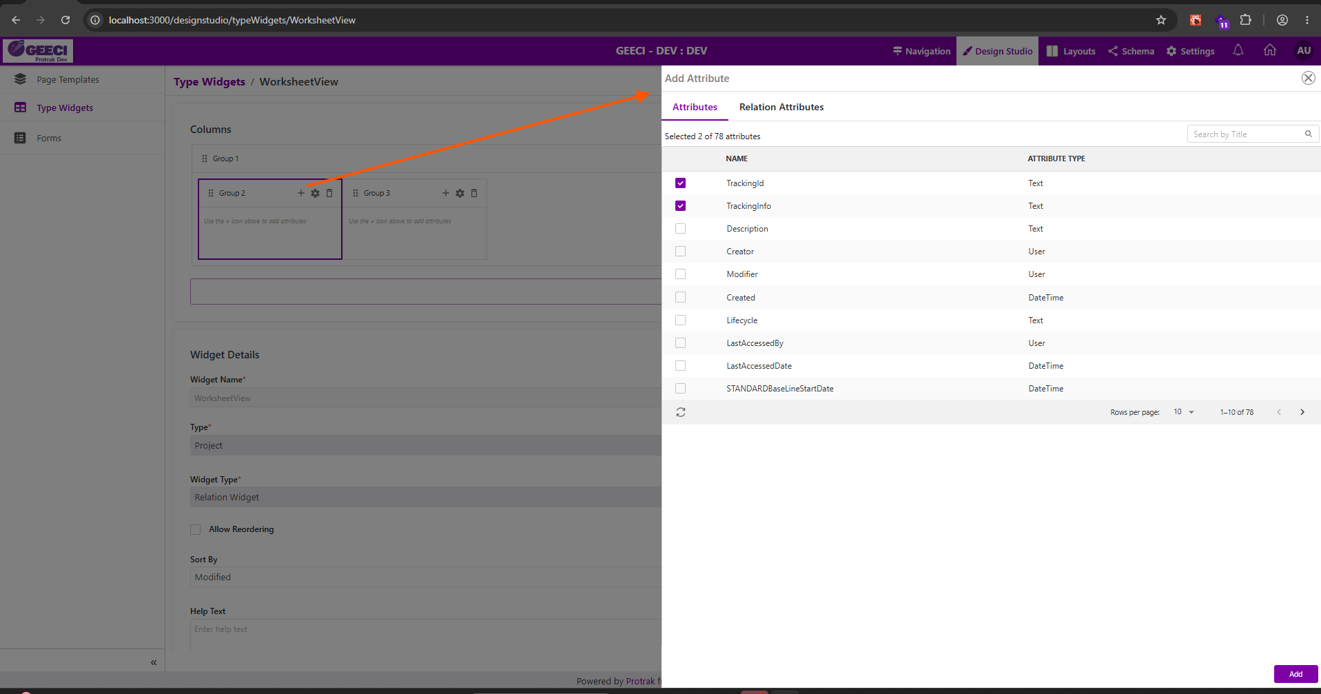 The Add Attribute flyout, opened from a group's + icon — showing the Attributes and Relation Attributes tabs, the
 Selected 2 of 78 attributes count, Search by Title, the checkbox list with attribute types, and the footer Add button.
Excluding Columns
- To remove a column from the default visible set, click the column's X (remove) icon or toggle its Visibility switch off. The column is removed from the grid and appears unselected in the attribute flyout, so it can be re-added later.
Column Order
Drag columns in the designer to reorder them. The order here is the default column order users see in the grid.
Column Settings
| Setting | Description |
|---|---|
| Display Name | Column header label shown to users |
| Attribute Renderer | How the value is displayed (text, date, link, etc.) |
| Attribute Editor | How inline editing works (Default, Dropdown, etc.) |
| Visibility | Toggle column on/off by default |
| Conditional Formatting | Highlight rules (e.g., red cell when Status = "Overdue") |
| Width | Column width (0 = auto) when Shrink to Fit is off |
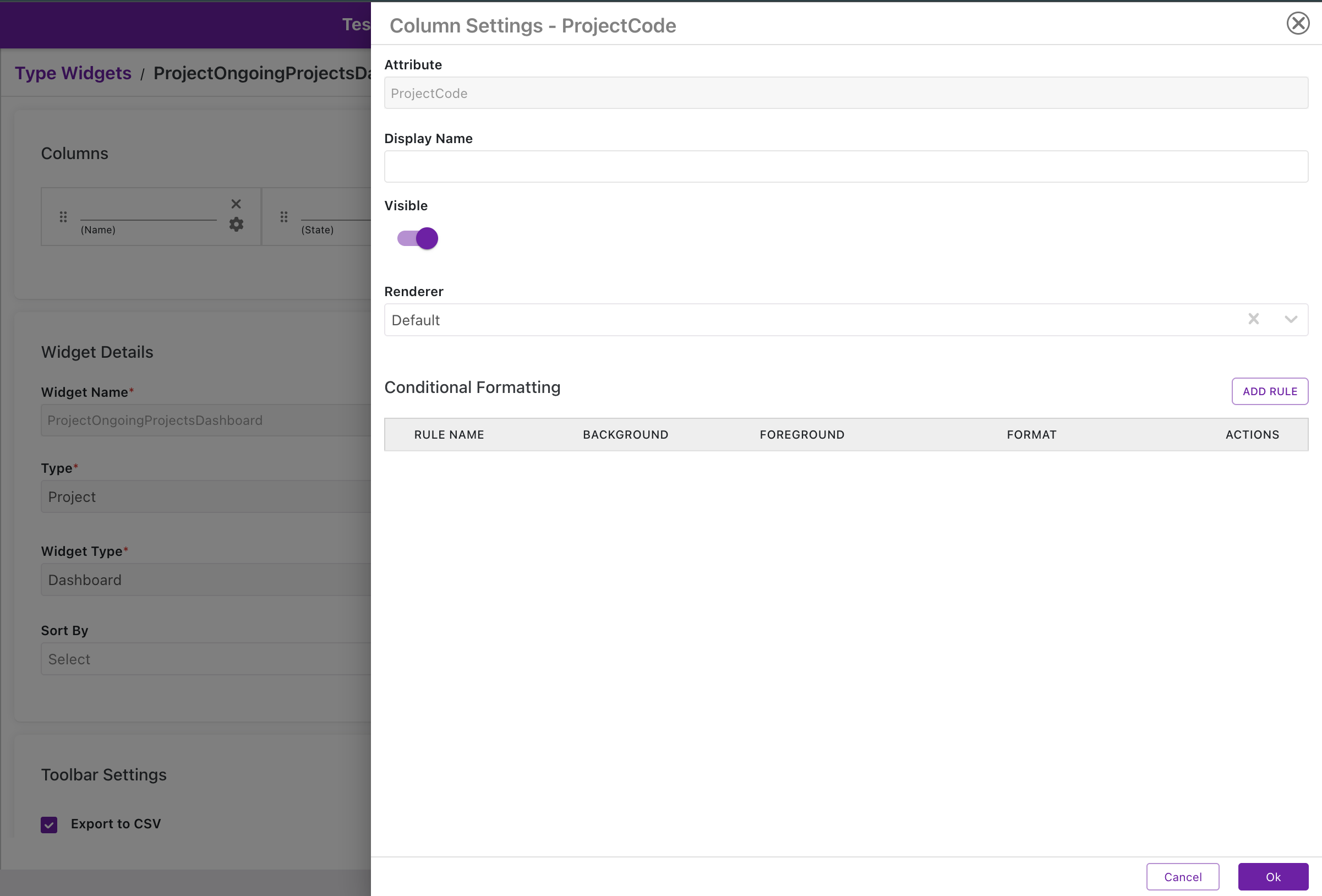 Column Settings dialog for a regular attribute — showing Attribute name, Display Name, Visible toggle, Renderer selection, and Conditional Formatting rules table.
Actions Column
If a column is configured for Actions, open its Column Settings to manage the Configured Actions list. This controls which row-level actions appear and their order.
-
Add actions (two ways):
- Add Action — add a single action and set its type and display name.
- Add Default State — insert a predefined set of commonly used actions to quickly populate the column.
-
Manage actions: Drag the move handle to reorder actions; use the trash icon to remove one.
-
Show As: Choose how actions render (Inline, Dropdown, etc.).
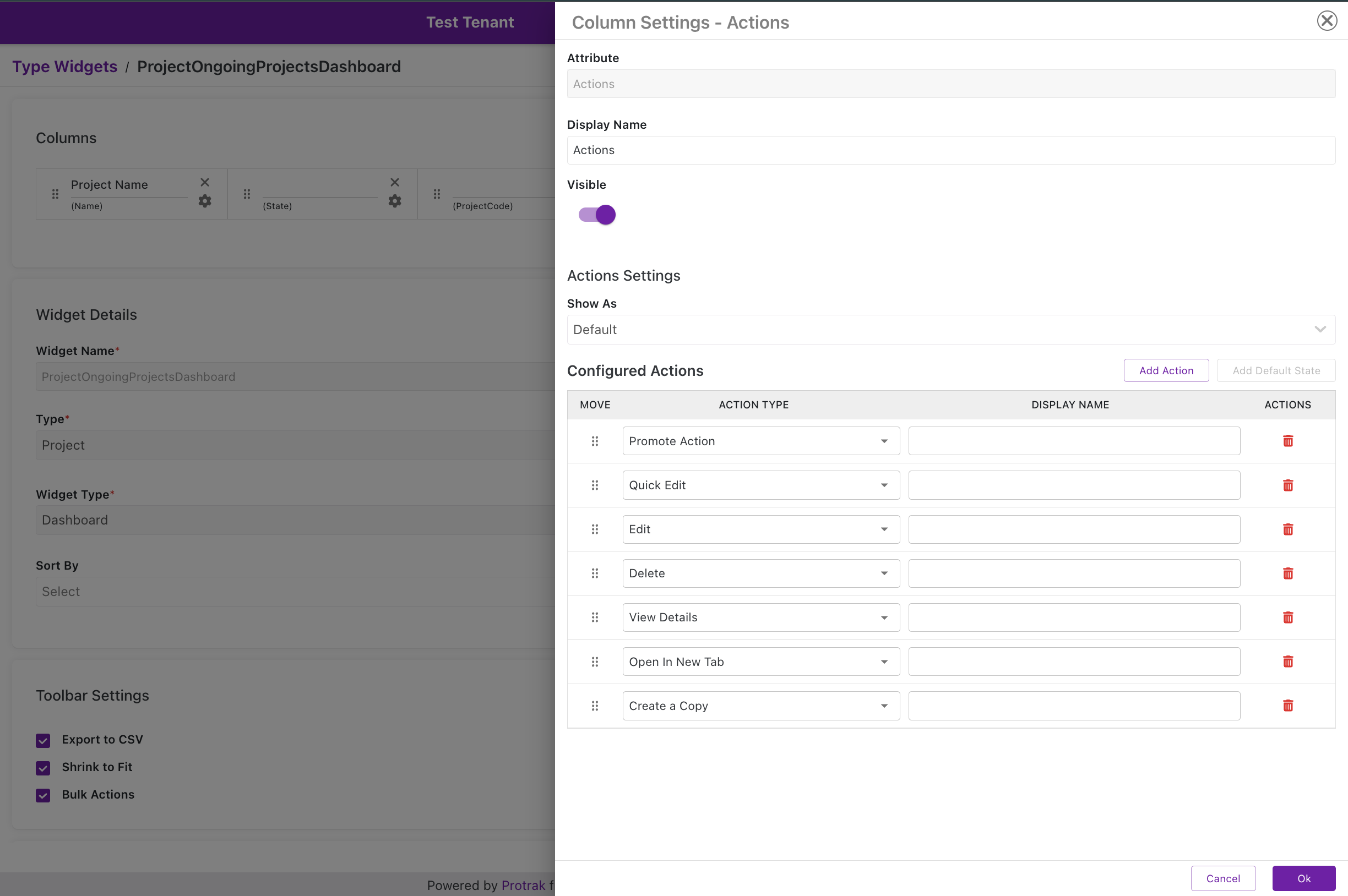 Actions Column Settings — Configured Actions list with action types (Promote Action, Quick Edit, Edit, Delete, View Details, Open In New Tab, Create a Copy), reorder handles, and Show As dropdown.
Report widgets don't have an Actions column — they render report data (table/chart/pivot), not a row-actionable grid.
The available row actions differ by Widget Category, since Dashboard and Relation widgets support different operations:
Dashboard widgets
| Action | What the user can do |
|---|---|
| Promote Action | Trigger a lifecycle promotion directly from the row |
| Quick Edit | Open the record in a compact inline-edit popup |
| Edit | Open the record in its Edit page |
| Delete | Delete the record |
| View Details | Open the record's View page |
| Open In New Tab | Open the record's View page in a new browser tab |
| Create a Copy | Duplicate the record as a new one |
| Print Sticker | Print a QR-code or custom Sticker-form label for the record |
| Create Related Instance | Create a new instance already linked via a relation |
| Link Related Instance | Link an existing instance via a relation |
Relation widgets
| Action | What the user can do |
|---|---|
| Promote Action | Trigger a lifecycle promotion directly from the row |
| Unlink | Remove the relation between the two instances (does not delete either record) |
| Edit | Open the related record's Edit page |
| Edit Relation | Edit attributes stored on the relation itself |
| Delete | Delete the related record |
| View Details | Open the related record's View page |
| Open In New Tab | Open the related record's View page in a new browser tab |
| Create a Copy | Duplicate the related record as a new one |
| Quick Edit | Open the related record in a compact inline-edit popup |
Relation widgets don't offer Print Sticker, Create Related Instance, or Link Related Instance as row actions.
Header Groups (Worksheet widgets only)
Worksheet widgets can group columns under shared header bands, so related columns sit together beneath a common title. Groups are configured as cards in the widget's header group designer.
Adding a group. Click Add Group to create a group. When a group card is selected, Add Group creates the new group inside it; when no card is selected, the group is created at the top level.
Adding attributes to a group. Click a group card to select it, then use the + icon on the card to open the attribute flyout scoped to that group. Attributes chosen there are added to that group rather than to the widget's top level.
How groups may be arranged. A group holds either attributes or other groups, never both. Where this rule prevents an action, Add Group is unavailable and the tooltip explains why — either because the group already holds attributes, or because groups at that level already hold attributes.
In the flyout, attributes belonging to a different group appear selected but locked, so a column cannot be moved between groups or removed from a group other than the one being edited.
Group selection is a convenience while configuring the widget and is not part of the saved configuration.
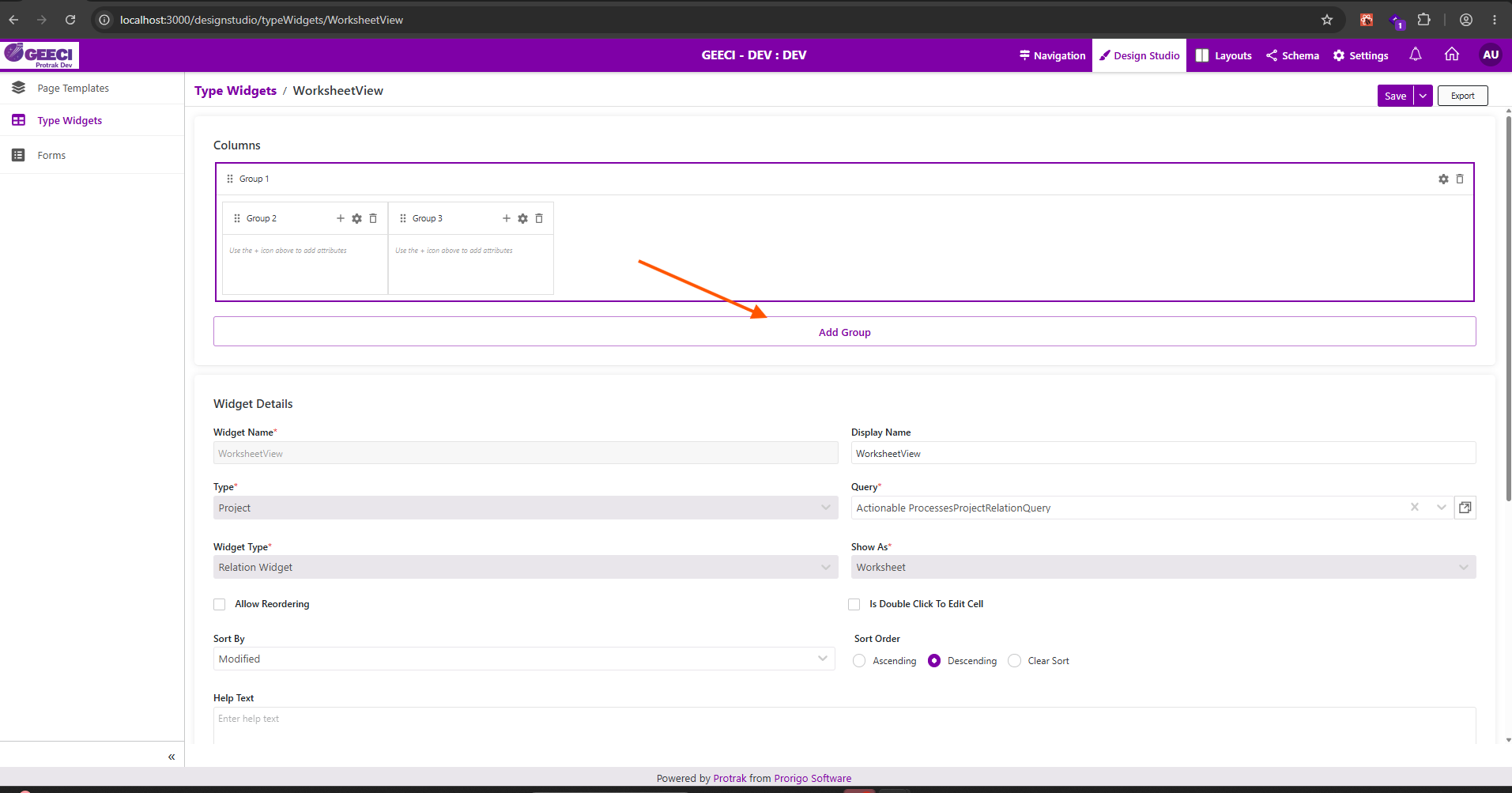 Worksheet header group cards —
 Group 1 holding the nested Group 2 and Group 3, each with its own + icon for adding attributes to that group, and Add Group below to create a further group.
Link Options (Relation Widgets only)
Relation widgets have a Link Options table on the widget's Basic tab — this is separate from Column Settings and isn't available on Dashboard or Report widgets.
| Link Option | Controls |
|---|---|
| Show Create Button | The Relation widget's + Create toolbar button, which opens the Create & Link popup to create a new instance of the related type |
| Show Search Button | A separate toolbar button for linking an existing instance via the relation instead of creating a new one |
Each row has a Visible toggle and an optional Display Label. Click the ⚙ (gear) icon on a row to expand its settings — for Show Create Button, this is where you optionally pick a specific Create Template for the popup instead of the related type's default Create template.
For the full walkthrough — including the Create Template dropdown, the role-based template resolution, and how this compares to the equivalent setting on a Reference attribute field — see Create & Link Popup.
Filter Settings
Filters define the default data scope of the widget. These are all powered by your Query Definition's filter configuration. Filter Settings include enforce query filters to be applied on the widget:
- Enforce State Filter: Always apply the query's state filter to the widget's dataset.
- Enforce Attribute Filter: Always apply attribute filters defined by the query.
- Enforce Parent Filter: Always apply the parent relation filter (useful for child lists).
All these filters originate in the Query Definition. The widget inherits them — you are not re-configuring filters in the widget itself, you are choosing a query that already has the right filters. See Query Definitions for how to set these up.
Toolbar Settings
Configure which buttons and toggles appear in the widget's toolbar:
| Button | Description |
|---|---|
| Export to CSV | Download the widget data as a CSV file |
| Shrink to Fit | Auto-adjust column widths to fit within the viewport |
| Bulk Actions | Enable multi-select row actions — see below for what's available |
Bulk Actions
When enabled, users can select multiple rows and trigger one action across all of them in a single pass. Like row actions, the available bulk actions differ by Widget Category.
Report widgets don't support Bulk Actions — there's no selectable row grid to act on.
| Action | Dashboard widgets | Relation widgets | What it does |
|---|---|---|---|
| Promote | ✅ | ✅ | Trigger a lifecycle promotion for every selected record |
| Delete | ✅ | ✅ | Delete every selected record |
| Print Sticker | ✅ | ❌ | Print one label per selected record, one label per page |
| Unlink | ❌ | ✅ | Remove the relation for every selected record (does not delete either record) |
| Custom | ✅ | ✅ | Run a tenant-defined custom bulk action |
Managing Type Widgets
The Type Widgets grid supports: Search, Filter by category, Create, Edit, Delete, Export, Pagination.
- Click any widget row to open its configuration
- Widgets can be referenced by multiple templates of the same type simultaneously — editing a widget updates it everywhere
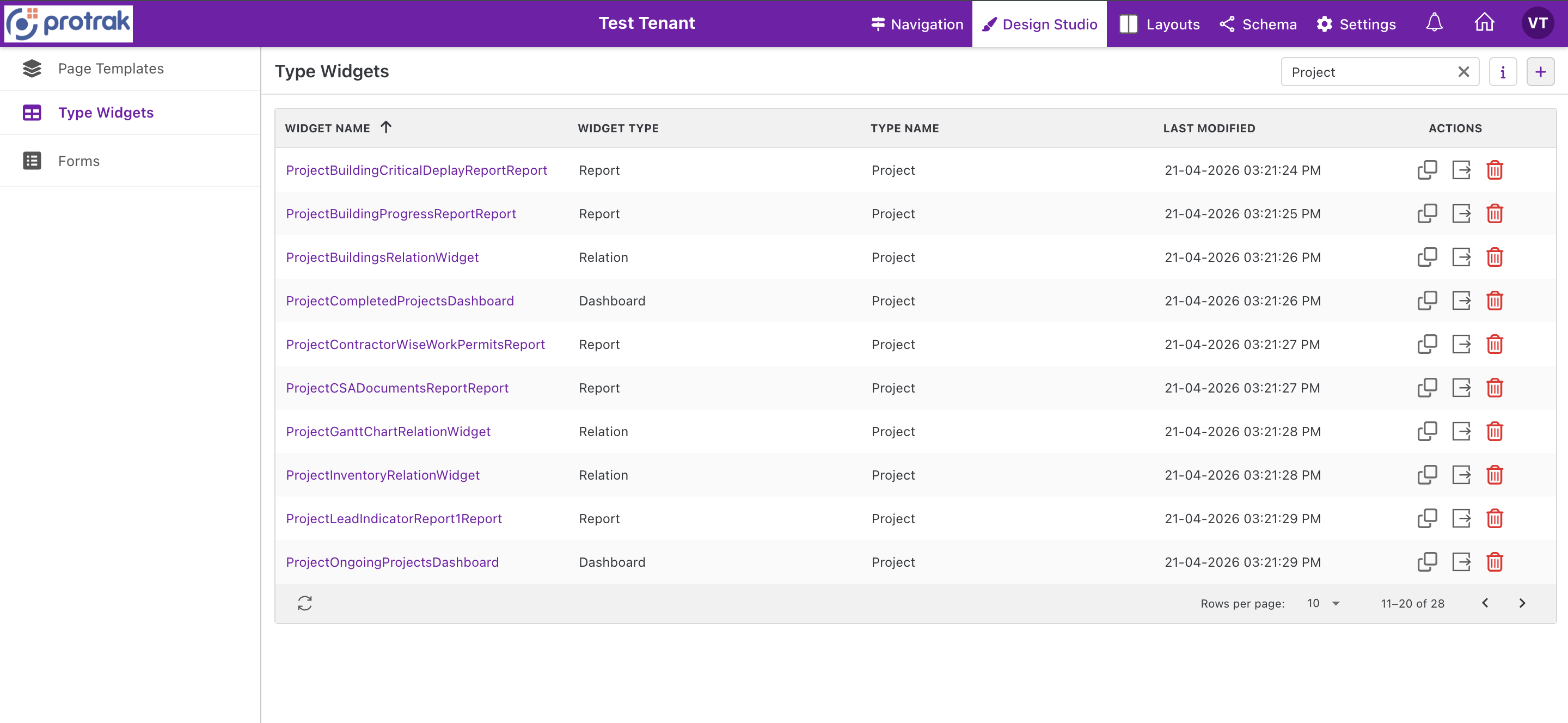 The Type Widgets grid — listing widgets with their widget type (Report, Dashboard, Relation), associated type name, last modified date, and action buttons.
Next Steps
- Building queries to power your widgets: Query Definitions
- Placing widgets on templates: Page Template Editor
- Showing records on a calendar: Calendar Widget
- Planning a week on an editable board: Sprint Planner Widget
- Design a compact inline-edit popup: Quick Edit Action
- Configure the Relation widget's Create & Link popup: Create & Link Popup