Page Templates
Configure Purpose-Built Experiences Without Custom Screen Development
Protrak Page Templates enable organizations to configure consistent, role-appropriate pages for users across the application—without developing separate screens for each process or user group.
Using Design Studio, administrators can create and manage templates for home pages, dashboards, reports, and record Create, Edit, and View experiences. Each template can combine forms, reports, dashboards, relationships, activities, attachments, workflows, messages, geolocation, and custom widgets to present the right information and actions in one contextual workspace.
This helps organizations replace generic, one-size-fits-all pages with focused experiences that support the way each team works.
Build Pages for Every Stage of Work
Page Templates support six key experience types:
| Template | Business purpose |
|---|---|
| Home | Create personalized landing pages for teams, with tasks, messages, activity updates, reports, dashboards, and quick information. |
| Dashboard | Present operational KPIs, charts, lists, and performance indicators in a focused workspace. |
| Report | Provide report-specific pages with relevant analysis and supporting widgets. |
| Create | Guide users through structured data entry when creating a new business record. |
| Edit | Give users a controlled workspace to update information, while keeping the process simple and consistent. |
| View | Provide a complete record workspace with its details, relationships, documents, lifecycle, activities, workflow, messages, location, and available actions. |
Assemble Pages with Configurable Widgets
Administrators can assemble each page using a library of standard, reporting, dashboard, form, relationship, and custom widgets. Widgets can be selected based on the purpose of the page and the information a user needs to see or act upon.
For example, a service manager’s home page can include open-ticket reports, team workload dashboards, recent messages, and quick links. A project record view can show project details alongside related tasks, documents, approvals, discussions, and lifecycle status.
Each widget can be configured with its own title, display options, visibility rules, border and layout settings, and business-specific properties. This allows the same underlying platform capability to be presented differently for different processes and audiences.
Deliver Role-Relevant User Experiences
Templates and individual widgets can be made available to everyone or restricted to selected roles. This enables each user group to work with an experience appropriate to its responsibilities.
For example:
- A field agent can see assigned jobs, forms, attachments, location information, and completion actions.
- A dispatcher can see workload dashboards, schedules, pending tickets, and assignment controls.
- A manager can see team performance, overdue work, reports, and approval actions.
- An administrator can access operational controls and configuration-related information without exposing them to standard users.
Role-based presentation improves usability, reduces unnecessary information on screen, and helps organizations align the application experience with their operating model.
Support Desktop, Tablet, and Mobile Work
Page Templates support responsive layouts for desktop, tablet, and mobile devices. Administrators can design and review each experience for different screen sizes, then make device-specific adjustments where required.
A template can therefore provide detailed, information-rich views for office users while delivering a simplified and practical experience for mobile or field users. Changes made for one device can be managed independently, helping organizations preserve usability across different work environments.
Control Page-Level Actions
This section covers only the Action Settings panel on View templates. Row and bulk actions on Dashboard/Relation Type Widgets are a separate, per-widget configuration — see Type Widgets: Row & Bulk Actions instead.
View templates can include configurable page actions such as navigating to related information, editing, deleting, duplicating, printing, or launching custom actions.
Administrators can choose which actions are available, enable or disable them as needed, and arrange them in the preferred order. This gives organizations a way to guide users toward the correct next step while preventing irrelevant or unauthorized actions from appearing on the page.
Actions are added one at a time in the Action Settings panel — each action type can be used only once per template. Most actions need nothing more than being added to the list; a few have their own settings, and those are covered on their own pages.
| Action | What the user can do |
|---|---|
| Edit | Open the record in its Edit page |
| Create a Copy | Duplicate the record as a new one |
| Export | Download the record's data |
| Annotate File | Open an attached PDF or image file in a full-screen markup tool and store the annotations on the record |
| Export Dynamic Form | Download the record's dynamic form data |
| Import Dynamic Form | Upload dynamic form data onto the record |
| Print Sticker | Print a QR or barcode sticker for the record — offered only when tracking is enabled for the type |
| Geolocate | Show the record's location — offered only when geolocation is enabled for the type |
Auto Save, Split View, and Tab View are not actions — they are toggles in the View template's Page Settings panel. See Forms in View Templates.
Reuse, Adapt, and Govern Templates
Templates can be searched, cloned, exported, edited, and reused across similar business processes. A team can begin with a proven template and adapt it for another department, record type, geography, or role instead of designing every experience from the beginning.
This makes it easier to standardize user experiences while still allowing controlled variation where business processes differ.
Common Use Cases
- Service operations: Configure ticket pages for dispatchers, field agents, and supervisors, each with the relevant job details, schedules, documents, actions, and performance views.
- Project delivery: Create project workspaces that bring together project data, tasks, documents, approvals, activities, risks, and reports.
- Quality and inspections: Present inspection forms, checklists, attached evidence, findings, corrective actions, and workflow status in a single record view.
- Management dashboards: Create role-specific home pages and dashboards for monitoring workload, exceptions, targets, overdue activities, and operational KPIs.
- Controlled business processes: Configure Create and Edit pages that guide users through structured data capture and ensure that the required information is available at each stage.
- Customer and asset management: Provide a consolidated view of customer, asset, service history, related records, attachments, communications, and lifecycle information.
Need to build a template right now? Follow the Design Studio Workflow for a step-by-step recipe.
What You Can Build
| Template Type | Layout | What Goes Inside |
|---|---|---|
| Home | Grid | Standard widgets (Tasks, Messages, Activity Log, Rich Text, Text, Separator), Dashboard widgets, Report widgets, Custom widgets |
| Dashboard | Classic | Dashboard widgets, Report widgets, Custom widgets |
| Report | Classic | Report widgets, Custom widgets |
| Create | Classic | Form widget(s), Custom widgets |
| Edit | Classic | Form widget(s), Custom widgets |
| View | Classic | Form widget(s), Relation widgets, standard View widgets (Attachments, Lifecycle, Messages, Activities, Workflow, Geolocation), Custom widgets |
Home uses a free-form Grid canvas — drag, drop, and resize freely across Desktop, Tablet, and Mobile. All other types use a Classic layout with pre-defined widget sections. The widget library and settings panel work identically in both — Classic layouts just don't support free repositioning or resizing.
View templates also include an Action Settings Panel for configuring page-level actions (Edit, Create a Copy, Export, Annotate File, Print QR Code, etc.) — drag to reorder, enable or disable each action. See Control Page-Level Actions for the full list.
Creating a Template
- Navigate to Design Studio → Page Templates and click Create
- Fill in the settings:
| Field | Description | Required |
|---|---|---|
| Template Display Name | User-visible name | Yes |
| Template Name | System identifier | Yes |
| Template Type | Home, Dashboard, Report, Create, Edit, or View | Yes |
| Visibility | Everyone or Specific Roles | Yes |
| Roles | Role selector (when Visibility = Specific Roles) | Conditional |
| Background Color | Template background | No |
| Type Name | Associated Protrak type (required for all except Home) | Conditional |
- Click Create — you are taken to the visual editor
These settings can also be edited later via the ⚙ icon in the editor toolbar.
Managing Templates
- The grid supports Search, Create, Edit, Clone, Delete, Export, and Pagination.
- Use Save As in the editor to create a copy before making significant changes.
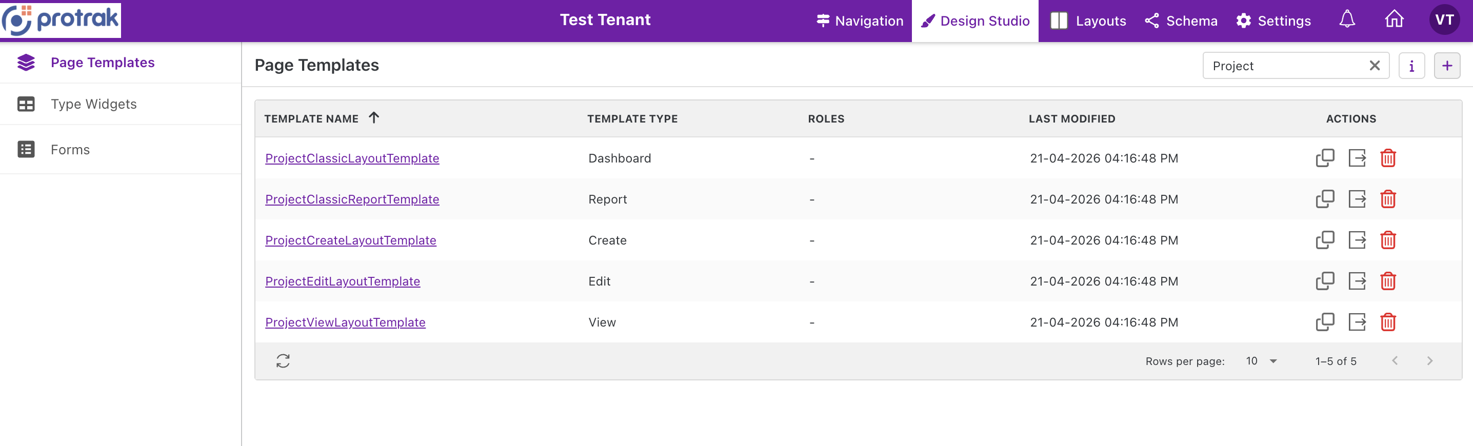 The Page Templates grid — listing all templates for a type with template type, roles, last modified date, and action buttons (clone, export, delete).
Editor Interface Overview
When you open a template for editing, the editor presents a multi-panel layout:
┌──────────────────────────────────────────────────────────────────┐
│  Page Templates / Template Name       Undo Redo  │ 📱 💻 │ 👁 ⚙ 💾 │
├────────────────┬─────────────────────────────────┬───────────────┤
│                │                                 │               │
│   Widget       │          Designer               |    Settings   │
│   Library      │          Canvas                 │     Panel     |
│                │                                 │               │
│   (Left)       │          (Center)               │    (Right)    │
│                │                                 │               │
└────────────────┴─────────────────────────────────┴───────────────┘
The interface consists of:
- Header Bar — Breadcrumb navigation, undo/redo, device selector, preview, settings, and save actions
- Widget Library (Left Panel) — Categorized list of available widgets to drag onto the canvas
- Designer Canvas (Center) — The grid area where widgets are positioned and resized
- Widget Settings Panel (Right Drawer) — Configuration panel that appears when a widget is selected
Here is how the editor looks for a Home template (Grid layout):
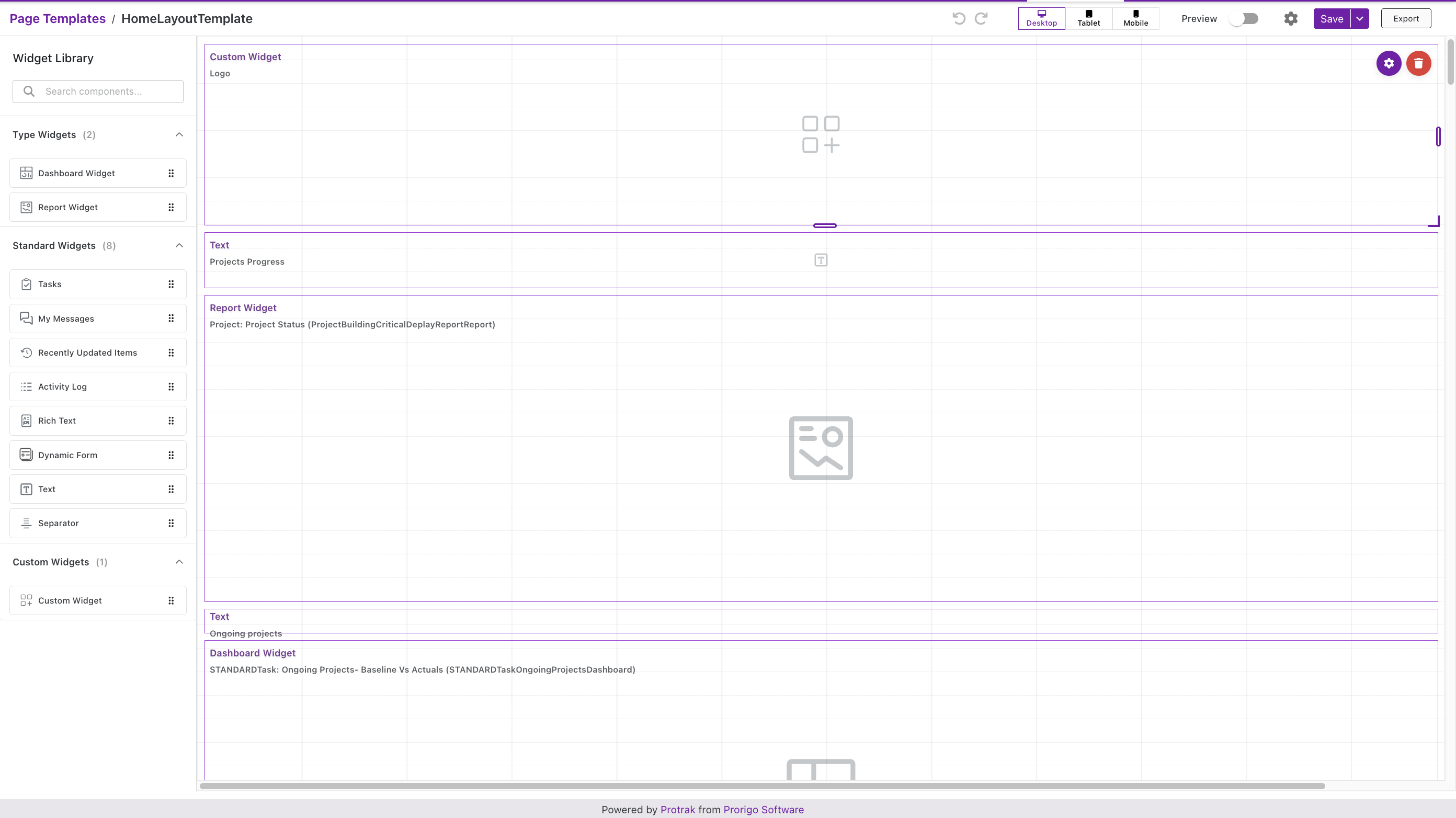 Home template editor — Widget Library on the left with Type Widgets, Standard Widgets, and Custom Widgets; the Grid canvas in the center showing placed widgets (Custom Widget, Text, Report Widget, Dashboard Widget).
And here is how it looks for a Classic layout template (Dashboard/Report/Create/Edit/View):
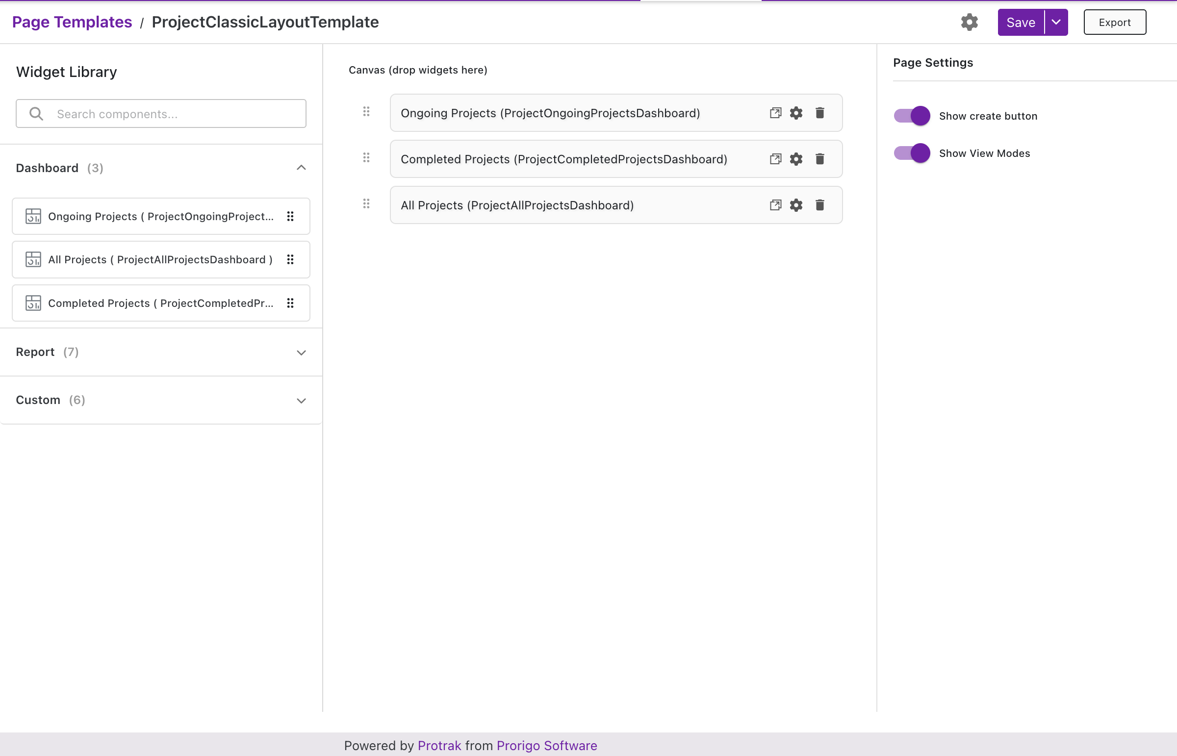 Classic template editor for a Dashboard — widgets are stacked vertically on the canvas with Page Settings (Show create button, Show View Modes) on the right.
Header Toolbar
| Control | What It Does |
|---|---|
| Breadcrumb | Navigate back to the Page Templates grid |
| Undo / Redo | Step back/forward through up to 10 changes (additions, deletions, moves, resizes) |
| Device Selector | Switch canvas between Desktop (12 col), Tablet (10 col), and Mobile (6 col) |
| Preview | Full-screen preview as users will see it, with device switching |
| Template Settings (⚙) | Edit name, type, visibility, roles, background color, and associated type |
| Save / Save As | Save changes or create a named copy. Save validates all widgets — missing required fields are flagged. |
When you switch devices:
- The canvas adapts and widget layouts are intelligently recalculated for the new column count
- Each device layout is saved independently — adjustments on one don't affect others
- Widgets added on any device are automatically synced to all devices
Widget Library
The library shows widgets available for the current template type, organized into collapsible sections. Drag any widget onto the canvas — it snaps to the grid and is automatically added to all device layouts. A search field at the top filters across all sections.
See the What You Can Build table above for which widgets are available per template type.
Classic layouts (Dashboard, Report, Create, Edit, View) use the same library but add widgets to pre-defined sections rather than a free-position grid.
Designer Canvas
┌─────────────────────────────────────────────────────┐
│       Grid (Home)       │  Classic (All Others)     │
├─────────────────────────┼───────────────────────────┤
│  Free position & resize │  Vertical stacking only   │
│  Multi-device layouts   │  Re-order by drag         │
│  12/10/6 column grid    │  No resize                │
└─────────────────────────┴───────────────────────────┘
Create Classic templates have a single Form section filling the whole canvas — it accepts any number of Form widgets (drag and drop from the library). See Multiple Forms in Classic Templates below.
Edit Classic templates add a Pinned Forms section above the Form section — a form placed there stays above the tabs at runtime instead of living inside them. See Pinned Forms.
View Classic templates split the canvas into three sections:
- Pinned Forms section — Accepts Form widgets only, and keeps them above the tabs at runtime. See Pinned Forms.
- Form section — Accepts any number of Form widgets, same as Create/Edit.
- Widgets section — Accepts any number of other widgets (Custom, Relation, View-standard widgets, etc.). This section is unique to View templates — Create/Edit templates don't have it.
Canvas actions:
| Action | Grid (Home) | Classic (Others) |
|---|---|---|
| Add | Drag & drop anywhere | Drag into section |
| Select | Click widget | Click widget |
| Move | Free position | Vertical reorder only |
| Resize | Drag bottom-right handle | Not available |
| Delete | Remove from This Device / All Devices | Direct delete (returns to library) |
Multiple Forms in Classic Templates
On View and Edit templates, the canvas also has a Pinned Forms section above the Form section. A form placed there stays visible above the tabs instead of living inside them — see Pinned Forms.
Create, Edit, and View Classic templates can hold more than one Form widget in the Form section. This lets you split a long record into smaller, focused forms — for example, a "General Information" form followed by a "Shipping Details" form — instead of building one large form that covers everything.
Each Form widget on the page is independent: it points at its own Form (built separately in the Forms module), and it keeps its own Visibility (Everyone or Specific Roles) and Display Conditions. This means you can show or hide individual forms for different roles, or based on the record's current data — without affecting the other forms on the page.
Adding More Than One Form
- Open the Create, Edit, or View template in the Design Studio editor.
- Drag a Form widget from the Widget Library into the Form section of the canvas.
- Drag a second (or third, and so on) Form widget into the same section. There's no limit on how many you can add.
- Reorder forms by dragging them within the Form section — the order here is the order they're displayed to the user, top to bottom.
- Click each Form widget's settings icon to choose which Form it renders, and set its own Visibility and Display Conditions.
What Users See
On the Create, Edit, or View page, all of the visible Form widgets render one after another, top to bottom, as one continuous page — there's no tab or divider between them by default. A form that a user's role or the record's current data doesn't satisfy (per its Visibility or Display Conditions) is simply skipped, so the page always reads as a single, uninterrupted form.
On View templates that use Tab View, all of the page's forms are grouped under a single Details tab — adding more Form widgets does not create additional tabs.
Create a Copy and the Create & Link popup reuse the same Create-template rendering as the standalone Create page, so a multi-form Create template renders the same stacked forms in those popups too — including display conditions and reference-attribute lookups evaluated across all of the template's forms, not just the first.
Use Display Conditions on each Form widget to build a form that adapts to the record — for example, showing a "Cancellation Reason" form only when the record's Status is "Canceled".
Settings Panel
The editor has two settings panels on the right side:
Canvas Settings Panel (always visible)
This panel is permanently visible to the right of the canvas. It shows settings relevant to the template as a whole — particularly for Classic layouts, which have pre-defined sections.
Widget Settings Panel (opens on widget click)
Clicking a widget's settings icon opens a second panel with settings specific to that widget. All widgets share common settings:
| Setting | Description |
|---|---|
| Title | Display title shown on the widget |
| Show Title / Border | Toggle title bar and border visibility; set thickness and color when border is enabled |
| Visibility | Everyone or Specific Roles |
| Roles | Role selector (when Visibility = Specific Roles) |
| X / Y / Width / Height | Position and size — auto-updated on drag/resize |
- Widget-Specific Settings: In addition to common options, some widgets (like Dashboard, Report, RichText, Text, Separator and Form) have extra settings unique to their type—these appear in the settings panel when the widget is selected.
Here is an example of a Report Widget’s settings panel on a Home template:
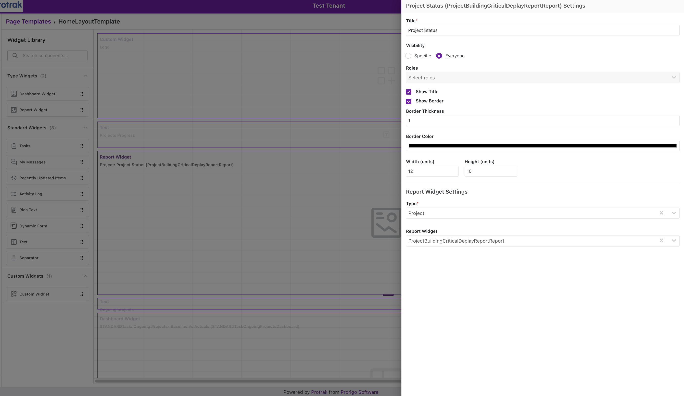 Report Widget settings — Title, Visibility, Show Title/Border, Border Thickness & Color, Width/Height, and Report Widget Settings (Type and Report Widget selection).
And a Dashboard Widget’s settings panel on a Classic (Dashboard) template:
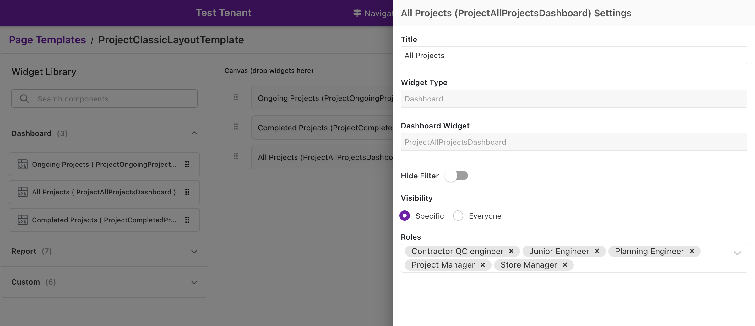 Dashboard Widget settings on a Classic template — Title, Widget Type, Dashboard Widget name, Hide Filter toggle, Visibility with role selection.
Multi-Device Design Workflow
Design Studio’s intelligent layout system ensures your templates look great on every screen size:
  ┌─────────────┐    ┌─────────────┐    ┌─────────────┐    ┌─────────────┐
  │  1. DESKTOP │───►│  2. TABLET  │───►│  3. MOBILE  │───►│  4. PREVIEW │
  │  (12 cols)  │    │  (10 cols)  │    │  (6 cols)   │    │ (all three) │
  │             │    │             │    │             │    │             │
  │ Design here │    │ Review &    │    │ Review &    │    │ Verify      │
  │ first       │    │ adjust      │    │ adjust      │    │ before save │
  └─────────────┘    └─────────────┘    └─────────────┘    └─────────────┘
Key rules:
- Adding a widget on any device syncs it to all devices automatically
- Removing from one device keeps it on others; Remove from All Devices deletes it completely
- Device layouts are saved independently after the initial auto-sync
Tips for Effective Template Design
- ✅ Group related widgets together — use Text/Separator widgets for visual sections
- ✅ Design Desktop first, then review Tablet & Mobile
- ✅ Use Preview before saving to catch rendering issues
- ✅ Use Undo freely — 10 levels available
- ✅ Use Save As before major changes to keep a backup
Next Steps
- Understand the end-user experience: Client-Side Experience
- Configure file markup on a View template: Annotate File Action
- Configure a different Create template for a Create & Link popup: Create & Link Popup