Forms
The Forms module is where you design the data entry and display experience for your type's instances. A Form defines the layout of fields and widgets on Create, Edit, and View pages — but it is not the page itself. It is a widget placed inside a page template.
Build the form here → Add it to the right template via the Page Template Editor. For the step-by-step flow, see the Design Studio Workflow.
The Title Content of a Title widget on the form canvas, and the Link Popup Header on Reference fields, support Dynamic Text placeholders like @Instance.OrderNo — so the text shown to users updates per record instead of staying static. On an Edit Relation form the title can also use @RelationAttribute.* and the type at either end of the relation — see Edit Relation Forms.
How Forms Fit In
Create / Edit / View Template
└── Form Widget  ←── references a Form you built here
└── Other widgets (Custom, Standard View widgets, Relation Widgets...)
For Create and Edit templates, the form is typically the primary widget — occupying most of the layout.
For View templates, the form sits alongside other widgets: Attachments, Lifecycle, Messages, Activities, Workflow, Relation Widgets, and Custom Widgets. Each can be independently positioned and sized on the canvas.
Creating a Form
- Navigate to Design Studio → Forms and click Create
- Fill in basic details:
| Field | Description | Required |
|---|---|---|
| Form Name | System identifier | Yes |
| Display Name | User-visible form title | Yes |
| Type Name | The Protrak type this form is built for | Yes |
- Click Save — the Form Builder opens
Form Modes
The Form Mode you set in Form Details controls what kind of layout the form is built for. It is locked after the first save — pick carefully.
| Mode | Purpose |
|---|---|
| Create | Data entry form for creating new records |
| Edit | Data entry form for editing existing records |
| View | Read-only display form placed on View page templates |
| QuickEdit | Compact popup for inline editing, for the Quick Edit action |
| EditRelation | Popup for the attributes stored on a relation, for link popups and the Edit Relation action |
| Sticker | Fixed physical-size print label for the Print Sticker action |
The Form Builder Interface
┌──────────────────────┬────────────────────────────────────────────────────┐
│  Components (Left)   │  Containers (Center)              Add Container+   │
│                      │                                                    │
│  [ Search... ]       │  ┌────────────────────┐  ┌───────────────────┐     │
│                      │  │ ⠿ Container A      │  │ ⠿ Container B     │     │
│  ▶ Attributes (N)    │  │ ⠿ Field 1          │  │ ⠿ Field X         │     │
│    (type attributes) │  │ ⠿ Field 2          │  │ ⠿ Field Y         │     │
│                      │  │ ⠿ Field 3          │  └───────────────────┘     │
│  ▶ Standard          │  └────────────────────┘                            │
│    Widgets (N)       │  ┌────────────────────────────────────────────┐    │
│                      │  │ ⠿ Container C                              │    │
│  ▶ Custom            │  │ ⠿ Widget P                                 │    │
│    Widgets (N)       │  └────────────────────────────────────────────┘    │
└──────────────────────┴────────────────────────────────────────────────────┘
Forms are container-based — you add containers first, then drop fields and widgets inside them. Each container is an independently configurable section.
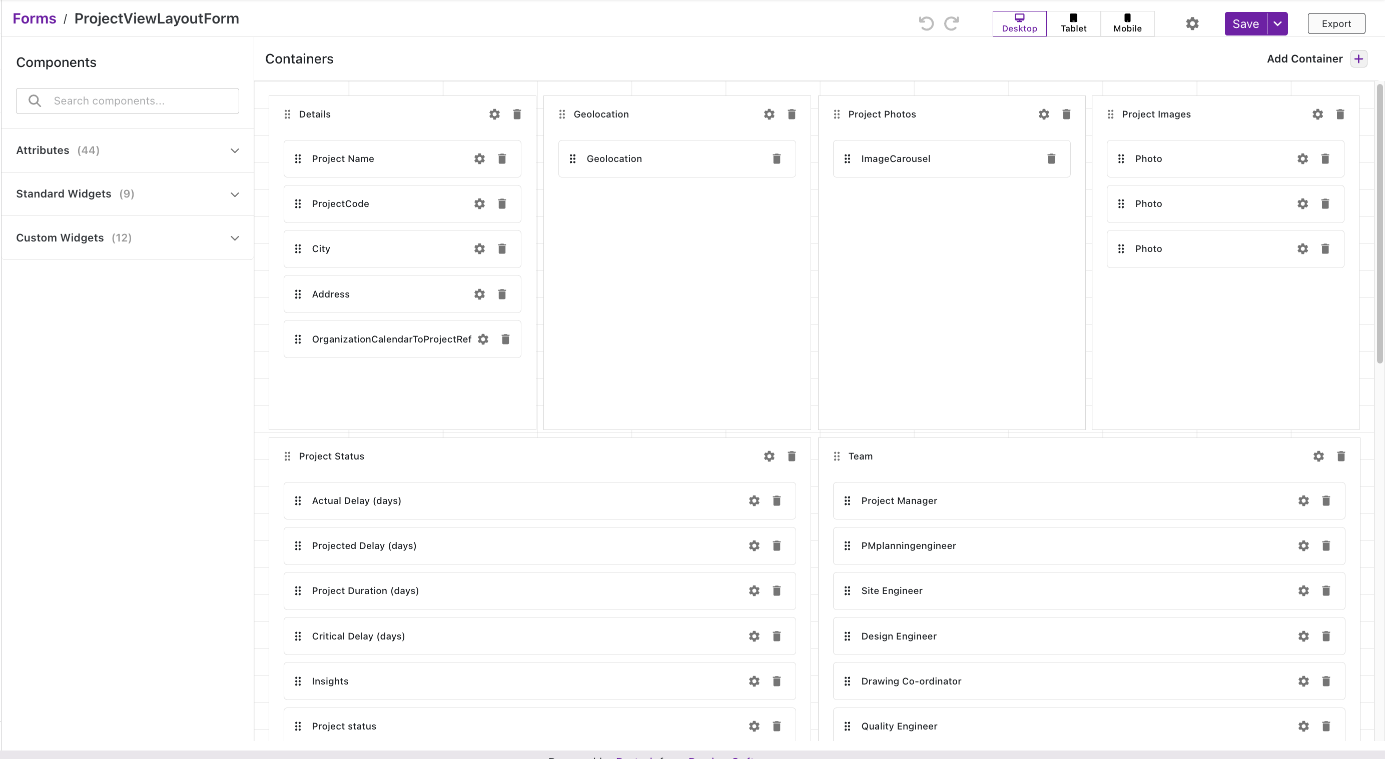 The Form Builder for a View layout form — Components panel on the left (Attributes, Standard Widgets, Custom Widgets) and Containers in the center (Details, Geolocation, Project Photos, Project Images, Project Status, Team) with fields arranged inside each.
Left Panel — Components
| Section | Contents |
|---|---|
| Attributes | All type attributes — drag into a container to add as a field |
| Standard Widgets | Built-in widgets (Text, Separator, Rich Text, etc.) |
| Custom Widgets | User-defined widgets configured for form context |
Center Panel — Containers
Click Add Container (top right) to add a container. Drag attributes and widgets from the left panel into containers. Each container and each field inside it can be independently configured via its ⚙ icon.
- Drag the ⠿ handle to reorder containers or fields within a container
- Delete with the 🗑 icon
Settings — Container ⚙
Container settings are the same regardless of what's inside the container:
| Setting | Description |
|---|---|
| Title | Container heading shown to users |
| Widget Type | Type of container (e.g., Fields) |
| Visibility | Everyone or Specific Roles |
| Roles | Roles that can see this container |
| Display Conditions | Show/hide this container based on field values |
| Show Title / Show Border | Toggle title and border visibility |
| Border Thickness / Color | Border styling when border is enabled |
| Height Behavior | How the container uses its authored height: Fit Content, Fixed, Max Height, or Min Height — see Container Height |
| Width / Height | Size in grid units |
| Background Color | Container background |
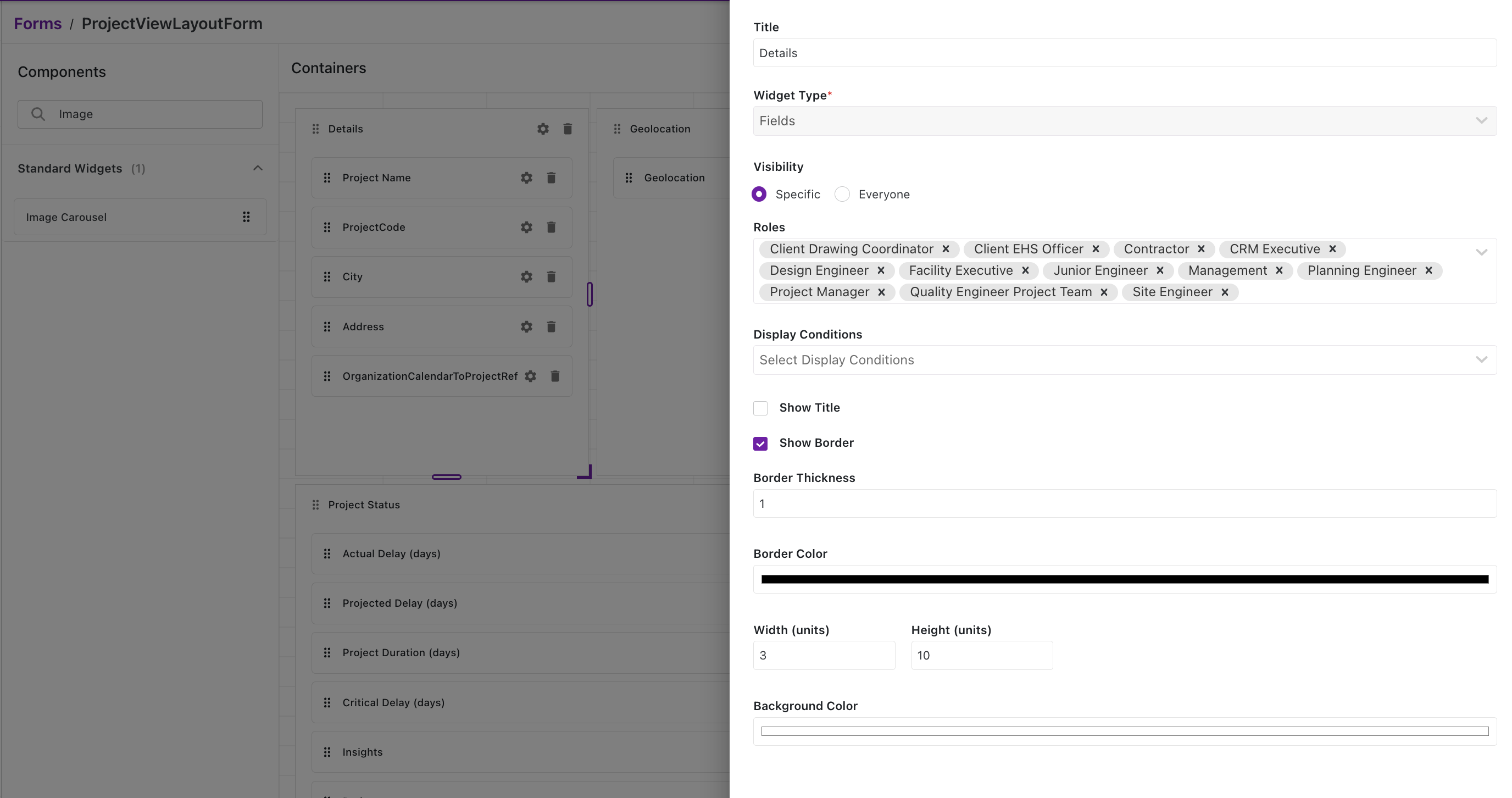 Container settings panel — Title, Widget Type (Fields), Visibility (Specific/Everyone) with role selection, Display Conditions, Show Title/Border toggles, Border Thickness & Color, Width/Height in grid units, and Background Color.
Settings — Field ⚙ (Attribute)
| Setting | Description |
|---|---|
| Attribute Name | Read-only — the system name of the attribute |
| Display Name | Label shown to users |
| Editor | How the field is edited (Default, Dropdown, etc.) |
| Renderer | How the value is displayed |
| Help Text | Inline guidance shown below the field |
| Placeholder | Hint text inside the input |
| QR/Bar Code | Render value as QR or barcode |
| Link Option (Reference attributes only) | Which button(s) the field shows: search an existing record, create a new one via the Create & Link popup, or both |
| Display Condition | Show/hide this field based on other field values |
| Conditional Formatting | Highlight rules (Background, Foreground, Format) per rule |
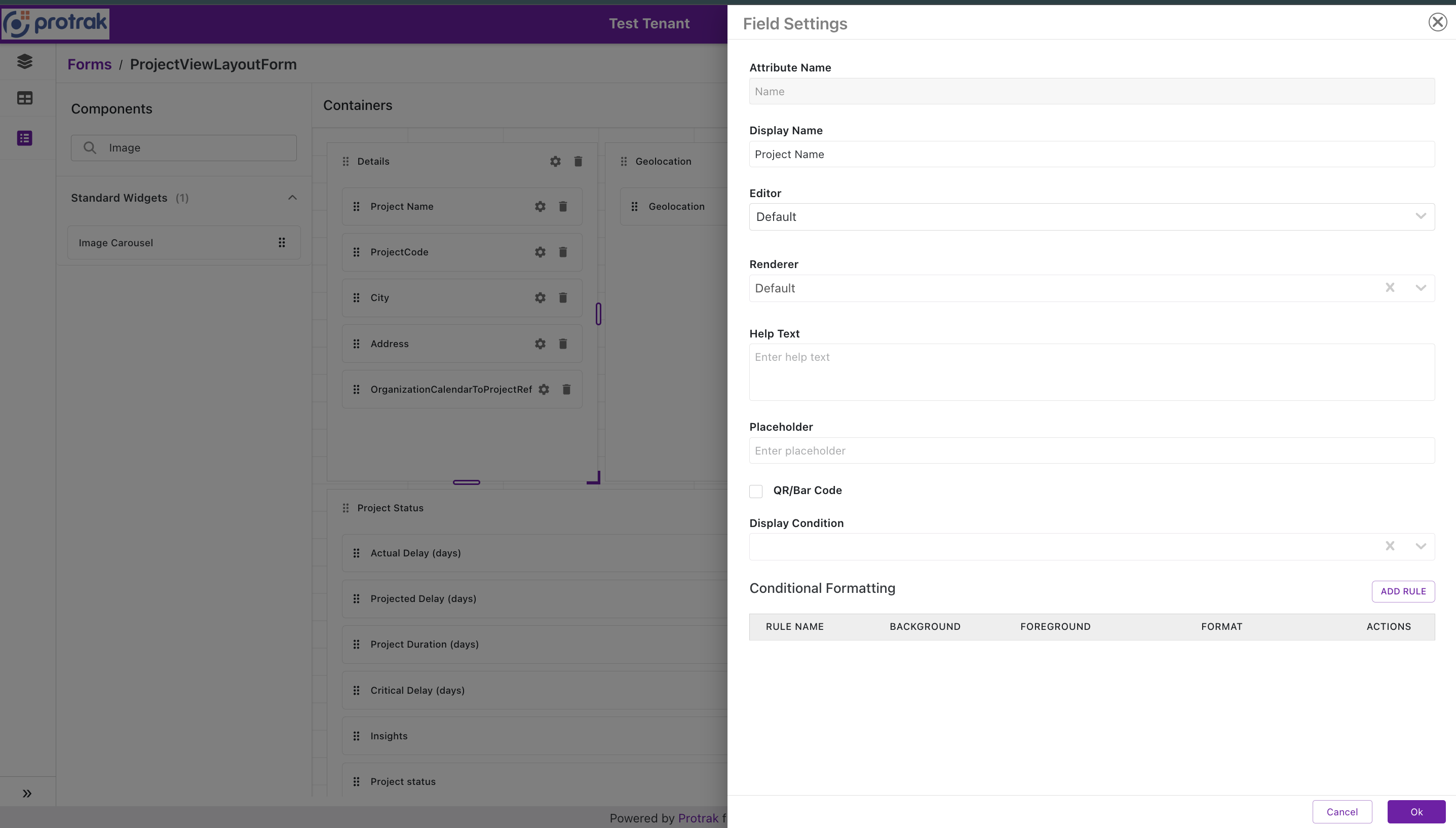 Field Settings dialog — Attribute Name, Display Name, Editor, Renderer, Help Text, Placeholder, QR/Bar Code checkbox, Display Condition, and Conditional Formatting rules table.
Settings — Standard / Custom Widget ⚙
Widgets inside containers have their own settings that differ from field settings — configure title, visibility, roles, display conditions, and widget-specific options as applicable. For example, the QR Code widget has an Encode from attribute setting that controls which text attribute's value the QR code encodes, and the Compact Lifecycle widget has a Display Mode setting that switches it between a Stepper and a Ribbon.
Display Conditions
Display Conditions make forms dynamic — fields and widgets show or hide in real time as the user fills out the form. No page reload needed.
How It Works
Each field/widget can have one or more conditions:
- Rule structure:
[Attribute] [Operator] [Value] - Operators: equals, not equals, contains, greater than, less than, is empty, is not empty
- Logic: AND (all rules must match) or OR (any rule matches)
- Value source: Static value, or a query parameter (dynamic value)
Example
You want a "Shipping Address" container to appear only when the user selects "Ship" as the delivery method:
Rule: DeliveryMethod equals "Ship"
Logic: AND
Result: Widget visible only when DeliveryMethod = "Ship"
As soon as the user changes the dropdown to something else, the container disappears instantly.
Display conditions work the same way in View templates — the form evaluates conditions against the instance's current data values.
Forms in View Templates
In a View template, the form is placed in the Form section (top of canvas) — this section can hold one or more Form widgets (see Multiple Forms in Classic Templates). Above it sits the Pinned Forms section, for a form that should stay above the tabs at runtime (see Pinned Forms). The rest of the canvas holds Relation Widgets, Standard Widgets (Attachments, Lifecycle, Messages, etc.), Versions, and Custom Widgets.
The View template also has a Page Settings panel (right side):
| Setting | Description |
|---|---|
| View Mode | Standard or Split — controls layout of the view page |
| View Mode Switch Icon | Icon shown to users to toggle between modes |
| Show Auto Save Button | Show/hide the auto-save button on the page |
| Hide Breadcrumb | Hide the type breadcrumb above the record name in the page header — off by default |
| Action Settings | Configure page-level actions: Edit, Create a Copy, Export, Annotate File, Print QR Code, Geolocate, Dynamic Form actions — add, reorder, or remove |
Form behavior in View mode:
- Fields render read-only by default — displaying instance data
- Display conditions evaluate against the instance's current attribute values
- Role-based visibility applies at both container and field level
- Specific fields can be made editable in view mode via field settings
- When View Mode is Split, all visible Form widgets render stacked in the top panel — they never appear as separate tabs, regardless of Tab View settings
Hide Breadcrumb:
By default the View page header shows the record's type above its name, as a link back to that type's dashboard:
Maintenance Requests /
MR-18-Jun-2026-5          State
                          Resolved
Turning Hide Breadcrumb on drops that line and centers the record name in the header, for teams who reach records from a link or a scan and have no use for the walk-up path:
MR-18-Jun-2026-5          State
                          Resolved
- The setting affects the record name only — the State and Version Number blocks keep their own labels
- It applies to the desktop header; the mobile header shows no breadcrumb either way
- Templates saved before the setting existed behave as if it is off
Managing Forms
The Forms grid supports: Search, Create, Edit, Clone, Delete, Export.
Deleting a form removes it from all templates that reference it — verify template references before deleting.
- Click any form row to open the Form Builder
- Cloning a form is useful for creating type-specific variations of a common layout
Next Steps
- Add a form to a template: Page Template Editor
- Return to the module overview: Admin Configuration Guide
- Design a print label layout: Sticker Forms
- Configure a QR code's encoded value: QR Code Widget
- Show a record's lifecycle progress on the form: Compact Lifecycle Widget
- Design a compact inline-edit popup: Quick Edit Forms
- Design the popup for a relation's own attributes: Edit Relation Forms
- Control how tall each container renders: Container Height
- Position field labels (above / left / below): Form Input Label Alignment
- Keep view and edit identical — no layout shift on inline edit: Render Read-Only Editor for All Attributes
- Configure a Reference attribute's search/create buttons and Create Template: Create & Link Popup
- Edit-mode form settings and behavior: Edit Forms