Client-Side Experience
What end users see and experience when Design Studio is enabled.
Page Map
┌─────────────────────────────────────────────────────────────────────┐
│                   V2 CLIENT PAGES                                   │
│                                                                     │
│  ┌─────────┐  ┌───────────┐  ┌──────────┐  ┌─────────────────────┐  │
│  │  Home   │  │ Dashboard │  │  Report  │  │ Create | Edit | View│  │
│  │         │  │           │  │          │  │                     │  │
│  │ Dropdown│  │   Tabs    │  │  Tabs    │  │  Form + Widgets     │  │
│  │ selector│  │  per type │  │  per type│  │  + Actions          │  │
│  └─────────┘  └───────────┘  └──────────┘  └─────────────────────┘  │
│                                                                     │
│  All pages: responsive │ role-based │ lazy-loaded │ cached          │
└─────────────────────────────────────────────────────────────────────┘
Key Highlights
- Responsive — layouts adapt across Desktop, Tablet, Mobile automatically
- Role-based — users see only templates and widgets assigned to their role
- Multiple templates — Home uses a dropdown selector; Dashboards/Reports use tabs
- Lazy-loaded — widgets outside the viewport load on scroll for performance
- Cached — templates cached locally for fast repeat visits
- Dynamic — display conditions show/hide widgets in real time based on data
Home Page
What Users See
After login, users land on the Home page which renders the first available Home template. The layout includes:
- Template Selector — If multiple Home templates are available for the user's role, a dropdown in the header lets them switch between templates
- Widget Grid — A responsive grid layout with all configured widgets
- Home Icon — Header shows a home icon with the active template name
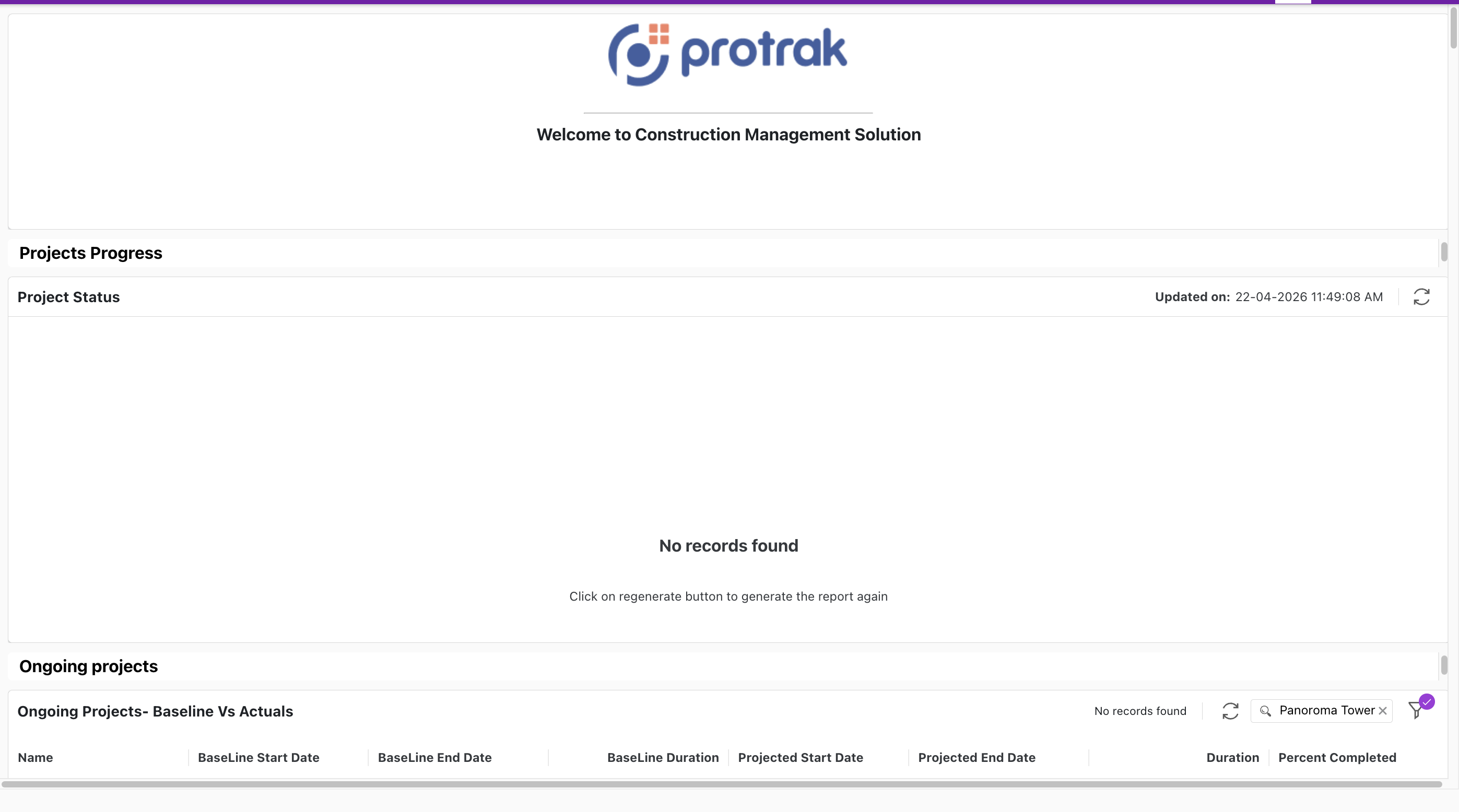 The client-side Home page as seen by end users — showing a Custom Widget (logo), Text widget, Report Widget (Project Status), and Dashboard Widget (Ongoing Projects — Baseline Vs Actuals).
Responsive Breakpoints
| Device | Columns | Breakpoint Width |
|---|---|---|
| Desktop (lg) | 12 | ≥ 1200px |
| Tablet (md) | 10 | ≥ 768px |
| Mobile (sm) | 6 | < 768px |
The grid automatically selects the appropriate layout based on the browser window width.
Type Dashboard
What Users See
When navigating to a type (e.g., "Customers"), users see the Dashboard page for that type:
- Template Dropdown — If multiple Dashboard templates exist for the type, dropdown-style navigation appears in the header
- Widget Dropdown — If there are multiple widgets in selected template, widgets dropdown is displayed in the header
Features
- Dashboard widgets display data tables with columns, filters, sorting, and row actions
- Report widgets display analytical visual or tabular reports
- Users can interact with widgets independently (filter, sort, paginate, export)
- Widget selection state persists across navigation within the session
Type Reports
What Users See
The reports page for a type shows all configured Report widgets in a grid layout:
- Page Title — Report page header with type name
- Widget Dropdown — Report widgets with full interactivity
- Template Navigation — Multiple templates supported with selection state
Features
- Report display formats (tables, charts, pivots — depending on configuration)
- Filter options per report
- Export to CSV
- Responsive layout adaptation
Instance View
What Users See
┌─────────────────────────────────────────────────────────────────────┐
│  [← Back]  TypeName / InstanceTitle        [State] [Action ▼] [⋯]   │
├─────────────────────────────────────────────────────────────────────┤
│  Tab 1 (Details)  │  Tab 2 (RelationWidget) │  Tab 3 ...  │  >      │
├─────────────────────────────────────────────────────────────────────┤
│                                                                     │
│  ┌──────────────┐  ┌──────────────┐  ┌──────────────┐               │
│  │  Container A │  │  Container B │  │  Container C │               │
│  │  Field 1     │  │  Field X     │  │  Widget P    │               │
│  │  Field 2     │  │  Field Y     │  │              │               │
│  └──────────────┘  └──────────────┘  └──────────────┘               │
│                                                                     │
└─────────────────────────────────────────────────────────────────────┘
- Header — shows instance title, current state, action buttons (configured via Action Settings), and a template selector dropdown when multiple templates exist
- Tabs — each Relation Widget and Standard View widget (Attachments, Lifecycle, Messages, etc.) appears as a tab; tab labels match the widget display name
- Form — rendered as the Details tab (or first tab); if the template has more than one Form widget, they all render stacked, top to bottom, inside that single tab — never as separate tabs; fields display in containers as configured in the Form Builder; read-only by default
- Pinned forms — a form the template pins sits above the tab strip and stays on screen whichever tab the user is on, instead of appearing in the Details tab. See Pinned Forms
- Actions — the action button set (Edit, Create a Copy, Export, Annotate File, Geolocate, etc.) is configured per template in Action Settings;
Key Features
- Display Conditions — containers and fields show/hide in real time based on instance data values
- Multiple Templates — users with access to multiple View templates can switch via the template selector dropdown in the header
When containers or widgets are hidden by visibility rules or display conditions, remaining items automatically fill the gaps — no empty spaces.
Instance Create
What Users See
When creating a new instance, the Create page shows:
- Form Layout — A template-driven form with fields arranged by the administrator
- Custom Widgets — Any custom widgets configured for the Create context
- Dynamic Visibility — Fields and widgets appear/disappear based on form input
User Flow
- User navigates to create a new instance (e.g., "Create Customer")
- Form starts empty; display conditions initially hide dependent container
- As the user fills in fields, dependent widgets/container appear dynamically
- On save, the user is redirected to the View page for the new instance
Instance Edit
What Users See
Similar to the Create page, but pre-populated with existing instance data:
- Pre-filled Form — All fields populated with current values
- Editable Fields — Only fields the user has permission to edit are enabled
- Dynamic containers — Display conditions evaluate against current values
- Save / Cancel — Actions at toolbar of the form
Responsive Behavior
| Screen Size | Layout |
|---|---|
| Desktop | Full grid layout with form alongside related widgets |
| Tablet | Adjusted grid with fewer columns, some widgets may stack |
| Mobile | Vertically stacked layout for easy scrolling |
Widget Rendering
Standard Widgets
Standard widgets render their content automatically based on the user context:
| Widget | What the User Sees |
|---|---|
| Tasks | A list of tasks assigned to the user with status, due date, and actions |
| My Messages | Inbox-style message list with sender, subject, and timestamp |
| Recently Updated Items | A list of items the user recently created or modified |
| Activity Log | A timeline of system events and user actions |
| Rich Text | Formatted content (HTML) as designed by the administrator |
| Text | Styled text block with custom font, color, and alignment |
| Separator | A horizontal or vertical line dividing containers |
| Dynamic Form | An embedded interactive form |
Type Widgets (Dashboard & Report)
These widgets display live data based on their Type Widget configuration:
- Columns — Configured columns from the Type Widget appear as table headers
- Filters — Users can filter data using configured filter controls
- Sorting — Click column headers to sort (if enabled)
- Actions — Row-level actions (like Navigate, Edit, Delete) appear on hover or click
- Bulk Actions — Multi-select rows and apply batch operations
- Toolbar — Export, Print, Refresh, and other toolbar buttons (if configured)
- Pagination — Large data sets are paginated for performance
Custom Widgets
Custom widgets render their developer-defined UI. The page context provided depends on placement:
| Context | Data Available |
|---|---|
| Home | Widget name, display name |
| Create | Type name, form state |
| Edit | Type name, instance ID, form state |
| View | Type name, instance ID, full instance data |
Role-Based Personalization
User Request → Template Filtering (role match?) → Widget Filtering (role match?) → Gap Filling → Render
| Layer | What Happens |
|---|---|
| Template Filtering | Only templates matching user’s roles are shown |
| Widget Filtering | Within visible template, only matching widgets render |
| Gap Filling | Hidden widgets’ space redistributed to visible ones |
| No Empty Pages | If no templates match, appropriate message displayed |
Example Scenario
Consider a Home page with two templates:
Template A (Visibility: Managers, Executives)
- Dashboard Widget: "Revenue Overview"
- Dashboard Widget: "Team Performance"
- Tasks Widget
Template B (Visibility: Everyone)
- Tasks Widget
- My Messages Widget
- Recently Updated Items Widget
A user with the Manager role will see Template A as their default, with the option to switch to Template B. A regular user without the Manager role will only see Template B.
Performance Optimizations
The V2 layout system includes several performance features:
| Optimization | Description |
|---|---|
| Lazy Rendering | Widgets outside the viewport + a 2-row buffer are not rendered until scrolled into view |
| LocalStorage Caching | Template configurations are cached locally with modification timestamps |
| Session Caching | Selected template and widget state persists within the session |
| Layout Redistribution | Hidden widgets' space is reclaimed without layout shifts |
| Proportional Resizing | Device breakpoint changes recalculate layouts efficiently |
Next Steps
- Review common questions: FAQ & Troubleshooting
- Go back to admin setup: Admin Configuration Guide