Create Layout Widget
A Create Layout widget appears as a section on the new-record form. Use it when the standard field inputs in the form are not enough — for example, when you need to build a dynamic list, a complex picker, or a multi-step form inside a single section.
pageContext shape
Source: CreateWidgetRenderer.jsx
{
  // Record type (no instanceId — record doesn't exist yet)
  instanceType,

  // Attribute data (from the form so far)
  attributeValues,          // { [attrName]: attrObj } — current values
  editedValues,             // { [attrName]: attrObj } — in-progress edits
  getAttributeWorkingValue, // function(attrName) → current working value

  // Edit integration
  onAttributeEdit,    // function(attrName, attrObj, errorMsg) — sync to form
  createInstance,     // function() — trigger record creation programmatically
  saveOperationState, // { isLoading, isError, data }

  // Layout config
  layoutConfig,
  instanceEditDispatch, // Low-level reducer dispatch (advanced)

  // Clone support
  cloneSourceInstance,  // object | null — source record when creating from clone

  // Permissions
  allowedOperations,
  isPromoteInProgress,

  isCreateLayout: true, // Always true — identifies this as a create context

  // Common (always present)
  settings,
  userData,
}
Note: There is no
instanceIdand nosaveInstancein Create Layout. UsecreateInstance()to save the new record.
How it differs from Edit Layout
On the Create layout:
- There is no
instanceIdyet — the record doesn't exist until the user saves - Use
createInstance()(notsaveInstance()) to trigger record creation from the widget cloneSourceInstanceis available if the user started from a "clone" action
Example 1 — Dynamic option list stored as JSON
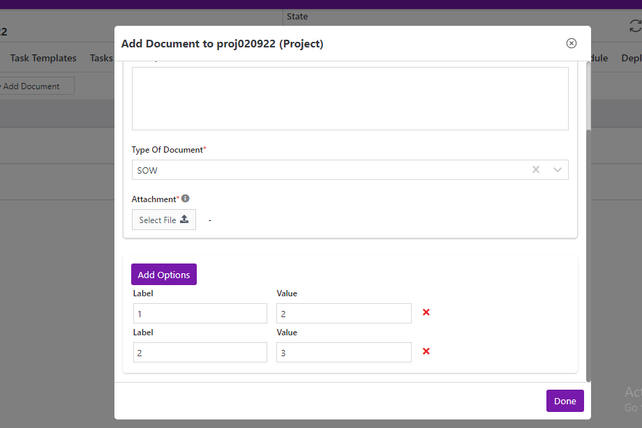
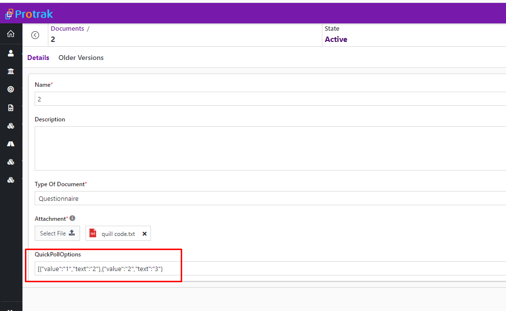
The widget lets the user build a list of poll options. Each time the list changes, it calls onAttributeEdit so the JSON value is stored in a text attribute.
function QuickPollOptionsWidget(pageContext) {
  const { protrakComponents } = React.useContext(customWidgetContext);
  const { Box, Button, ButtonEnums, Label, TextBox } = protrakComponents;

  const [options, setOptions] = React.useState([]);

  const syncToForm = (updated) => {
    pageContext.onAttributeEdit(
      'QuickPollOptions',
      {
        name: 'QuickPollOptions',
        type: 'Text',
        canUpdate: true,
        textValue: JSON.stringify(updated),
      },
      ''
    );
  };

  const addOption = () => {
    const updated = [...options, { value: '', text: '' }];
    setOptions(updated);
    syncToForm(updated);
  };

  const removeOption = (index) => {
    const updated = options.filter((_, i) => i !== index);
    setOptions(updated);
    syncToForm(updated);
  };

  const updateField = (index, field, val) => {
    const updated = options.map((o, i) =>
      i === index ? { ...o, [field]: val } : o
    );
    setOptions(updated);
    syncToForm(updated);
  };

  return (
    <Box style={{ display: 'block', padding: '1rem' }}>
      <Button
        onClick={addOption}
        text="Add Option"
        appearance={ButtonEnums.Appearance.Primary}
      />
      <table>
        <tbody>
          {options.map((opt, i) => (
            <tr key={i}>
              <td>
                <Label>Label</Label>
                <TextBox
                  value={opt.value}
                  onEdit={(v) => updateField(i, 'value', v)}
                />
              </td>
              <td style={{ paddingLeft: '1rem' }}>
                <Label>Value</Label>
                <TextBox
                  value={opt.text}
                  onEdit={(v) => updateField(i, 'text', v)}
                />
              </td>
              <td>
                <span
                  onClick={() => removeOption(i)}
                  style={{
                    marginLeft: '1rem',
                    color: 'var(--error)',
                    cursor: 'pointer',
                  }}
                >
                  <i className="fa fa-times" />
                </span>
              </td>
            </tr>
          ))}
        </tbody>
      </table>
    </Box>
  );
}
Before adding options:
After clicking "Add Option":
Example 2 — Pre-fill a field based on another field's value
Watch attributeValues to auto-fill a derived value when the user changes a related field.
function AutoFillCodeWidget(pageContext) {
  const { protrakComponents } = React.useContext(customWidgetContext);
  const { Text } = protrakComponents;

  const name = pageContext.getAttributeWorkingValue?.('Name')?.textValue ?? '';
  const autoCode = name.replace(/\s+/g, '-').toUpperCase().slice(0, 10);

  React.useEffect(() => {
    if (autoCode) {
      pageContext.onAttributeEdit(
        'Code',
        {
          name: 'Code',
          type: 'Text',
          canUpdate: true,
          textValue: autoCode,
        },
        ''
      );
    }
  }, [autoCode]);

  return <Text style={{ color: 'grey' }}>Auto-generated code: {autoCode}</Text>;
}
Tips
onAttributeEditpushes values into the standard form groups on the same layout — the standard Save button picks them up.- If your widget is the only way to enter a value, make sure the attribute is also marked as a required field in the Admin, so the form validates it on save.
- To handle the "clone" case (user duplicating a record), check
pageContext.cloneSourceInstanceand pre-populate your state from it. - For deep-dive patterns, see JSON Attribute Editor Pattern.