View Layout Widget (Relation Grid)
A ViewLayoutWidget is a special variant of the View Layout widget. It renders as a relation widget — the panel that shows instances linked to the current record through a relation type.
Use it when you want to replace the default related-instances table with a custom layout — for example, a card grid, a grouped table, or a custom column order.
The platform automatically provides Add, Link, Filter, and Export toolbar buttons above your widget (based on the user's permissions). Your widget only controls the data display area.
pageContext shape
Source: RelationWidget.jsx
{
  // Parent instance info
  instanceInfo: {
    instanceId,
    instanceType,
    instanceName,
    typePluralName,
    typeSingularName,
    getAllowedOperations,
  },

  // Relation type info
  relationInstanceInfo: {
    relationTypeName,
    relationTypeCardinality,
    relationTypeDetails,   // Full relation type config
    relationAttributes,    // Attributes configured on the relation
  },

  // Related instances data
  relatedInstanceInfo: {
    relatedTypeName,
    relatedInstanceDetails: {
      data: {
        items,         // Array of related instance objects
        total,
      }
    },
    totalRelatedItems,
  },

  // Permissions
  canConnect,        // boolean — user can link existing instances
  canLinkAndCreate,  // boolean — user can create and link new instances
  canCreateInstance, // boolean — user can create instances

  // Pagination and sorting
  paginationState: { skip, take },
  getNextPage,               // function() — load next page
  sortState: { sortBy, isSortByDescending },
  onSortApplied,             // function(sortState) — update sort

  reload,                    // function() — refresh the relation widget
  runRelatedInstanceQuery,   // function() — manually trigger a data fetch
  reloadInstanceDetails,     // function() — reload the parent record

  // Common (always present)
  settings,
  userData,
}
Also includes common pageContext properties.
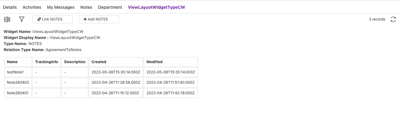
Example 1 — Simple relation table
Display the linked instances in a basic table, using the attributes configured for the relation.
function NotesRelationWidget(pageContext) {
  const { protrakComponents } = React.useContext(customWidgetContext);
  const { Box, Text } = protrakComponents;

  const items =
    pageContext.relatedInstanceInfo?.relatedInstanceDetails?.data?.items ?? [];

  const cellStyle = {
    border: '1px solid #ddd',
    padding: '8px',
    textAlign: 'left',
  };

  if (!items.length) return <Text>No linked items.</Text>;

  const columns = items[0].attributes.map((a) => a.name);

  return (
    <Box direction="column">
      <table style={{ borderCollapse: 'collapse', width: '100%' }}>
        <thead>
          <tr>
            {columns.map((col) => (
              <th key={col} style={cellStyle}>
                {col}
              </th>
            ))}
          </tr>
        </thead>
        <tbody>
          {items.map((item) => (
            <tr key={item.id}>
              {item.attributes.map((attr) => (
                <td key={attr.name} style={cellStyle}>
                  {attr.textValue ?? attr.numericValue ?? '-'}
                </td>
              ))}
            </tr>
          ))}
        </tbody>
      </table>
    </Box>
  );
}
Preview:
Example 2 — Card layout for related records
Show linked records as cards instead of a table row.
function RelatedProjectCards(pageContext) {
  const { protrakComponents } = React.useContext(customWidgetContext);
  const { Box, Text, H3 } = protrakComponents;

  const items =
    pageContext.relatedInstanceInfo?.relatedInstanceDetails?.data?.items ?? [];

  return (
    <Box
      style={{
        display: 'flex',
        flexWrap: 'wrap',
        gap: '1rem',
        padding: '1rem',
      }}
    >
      {items.map((item) => {
        const nameAttr = item.attributes?.find((a) => a.name === 'Name');
        const statusAttr = item.attributes?.find((a) => a.name === 'Status');
        return (
          <Box
            key={item.id}
            style={{
              border: '1px solid #ccc',
              borderRadius: '8px',
              padding: '1rem',
              minWidth: '180px',
            }}
          >
            <H3>{item.name}</H3>
            <Text>Status: {statusAttr?.textValue ?? '—'}</Text>
            <Text style={{ color: '#888', fontSize: '0.85em' }}>
              {item.state?.name}
            </Text>
          </Box>
        );
      })}
    </Box>
  );
}
Tips
- The toolbar (Add, Link, Filter, Export) is rendered by the platform — you don't build it.
- Call
pageContext.reload()after a user action (e.g., deleting a linked record) to refresh the list. - Use
canConnect/canLinkAndCreateto show or hide action buttons in your widget. - For embedded relation grids with full default Protrak behavior, see Embedded Instance Grid Pattern.