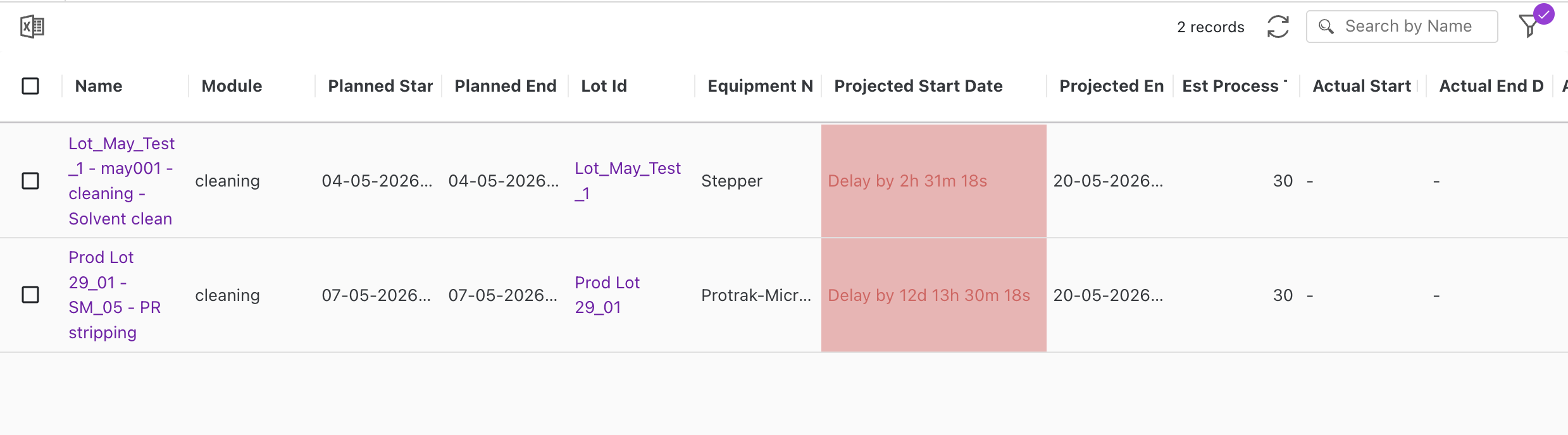
CountdownRenderer
Reference
- The
CountdownRenderercomponent displays a live (or static) countdown/delay indicator for aDateTimeattribute value. - It shows the calendar-aware time remaining until (or elapsed past) a target date, optionally comparing the attribute's own value against another
DateTimeattribute on the same instance. - If the resolved target date is invalid or missing, it falls back to rendering the value with
FormattedDateTime. - This is the same renderer used internally when a
DateTimeattribute'srendereris set toDelayCountdownRenderer, exposed here for use in custom widgets.
Props
value: the attribute's own date value (ISO date-time string).config: attribute configuration object, including:formatConditions: conditional formatting rules, same shape used by grid conditional formatting. See Styling below.rendererSettings:liveCountdown(boolean, defaulttrue): ticks every second when enabled; otherwise renders a static diff computed once.compareAgainstAttribute(string): name of anotherDateTimeattribute on the row to use as the target date instead ofvalue.countdownPrefix(string): text shown before the countdown value when the target date is in the future.delayPrefix(string): text shown before the countdown value when the target date is overdue.
style: an optional static inline style object for the countdown container. See Styling below.options: row/instance context. See Options below.
Styling
CountdownRenderer supports styling the same way conditional formatting works elsewhere in Protrak, with one extra behavior because the value ticks over time:
- Static style — pass
styledirectly (e.g.{ color: 'blue', fontWeight: 'bold' }). This is used as-is whenever there is no live conditional formatting to override it. - Live conditional formatting — if
config.formatConditionsis set andliveCountdownistrue(the default), the renderer re-evaluates the formatting rules againstoptionson every tick (every second), the same way the grid evaluatesformatConditionsfor a row. This lets a style change automatically as time passes — e.g. switch to a red background the moment a countdown becomes overdue — without the parent widget needing to re-render or recompute anything. - When a live-evaluated style is produced, it takes priority over the
styleprop. If you only want a static style, either omitformatConditionsfromconfigor setrendererSettings.liveCountdowntofalse. - Evaluating
formatConditionsrequires the same row/tenant context described underoptions.versionDetails/options.currentInstanceandoptions.settingsbelow — rules that reference attribute or user values won't match if that context isn't passed in.
Options
options mirrors the context the grid/attribute pipeline normally supplies, so passing the equivalent shape from a custom widget makes all renderer behavior (target comparison, tooltip formatting, live conditional formatting) work the same way:
options.versionDetails(falls back tooptions.currentInstanceif not set): the row/instance data object, shaped as{ attributes: [{ name, dateValue, ... }], ...otherInstanceFields }. Used to:- resolve
rendererSettings.compareAgainstAttribute— looked up by matchingnameinattributes. - act as the row data passed into
formatConditionsrule evaluation (see Styling).
- resolve
options.settings.settings.dateTimeFormat:{ timeFormat, dateFormat, utcOffset, timeZoneId }— tenant date/time format, used to render the full target date-time shown in the hover tooltip, and passed through as part of the settings object used to evaluateformatConditions.options.settings.userData: consumed byformatConditionsrules that check against the current user (e.g. a rule scoped to "assigned to me").- If
options(or parts of it) are omitted, the renderer falls back to safe defaults (UTC offset+00:00, no timezone, empty user data) —compareAgainstAttributeand user/attribute-basedformatConditionssimply won't resolve without the real context.
Usage
const { protrakComponents } = React.useContext(customWidgetContext);
const { CountdownRenderer } = protrakComponents;

//Example of config property, with live conditional formatting on overdue:
const config = {
  "fieldType": "Attribute",
  "attributeType": "DateTime",
  "label": "Due Date",
  "attributeName": "ADueDate",
  "renderer": "DelayCountdownRenderer",
  "rendererSettings": {
    "liveCountdown": true,
    "compareAgainstAttribute": "ACompletionDate",
    "countdownPrefix": "Remaining",
    "delayPrefix": "Overdue"
  },
  "formatConditions": [
    {
      "rule": { "rules": [ /* same rule shape as grid conditional formatting */ ] },
      "style": "background-color:#ffcccc;"
    }
  ]
}

//Example of options property, shaped like the context passed to attribute renderers generally:
const options = {
  "typeName": "Project",
  "instanceId": "<instance-guid>",
  // the row data; each attribute is a top-level key on versionDetails
  "versionDetails": {
    "ADueDate": { "name": "ADueDate", "type": "DateTime", "dateValue": "2026-02-01T00:00:00.000Z" },
    "ACompletionDate": { "name": "ACompletionDate", "type": "DateTime", "dateValue": null }
  },
  "customStyle": { "backgroundColor": "#fbe5e5", "color": "#cc2424" },
  "currentInstance": null, //instance data
  "settings": {
    "settings": {
      "dateTimeFormat": {
        "dateFormat": "dd-MM-yyyy",
        "timeFormat": "hmsa",
        "timeZoneId": "Asia/Kolkata",
        "utcOffset": "+05:30"
      }
    },
    "userData": { "userId": "<user-guid>", "name": "Sample User" }
  }
}

return (
  <CountdownRenderer
    value={value}
    config={config}
    style={{ backgroundColor: '#fbe5e5', color: '#cc2424' }} // static fallback style; overridden by formatConditions when they match
    options={options}
  />
);
// pass the attribute's value, its config, an optional static style, and row/options context
UI